
30 Mar Creating Simply Visual Headlines
Metrópoli is more about intuition than reflection: we do reflective intuition, if you like, based on lots of experience and training, with bags of energy, audacity and value thrown in. Our front covers attempt brave steps forward. We do not fear putting a foot wrong, or staring big mistakes straight in the eye; defects can be beautiful. Searching for them takes us back to the beginning of the graphic arts and highlights the artisan flavour we seek; finding them teaches us how to avoid the trap in the future, or at least know where they are.
We flee boredom. Doing the same thing day after day, over and over again, annihilates creativity. Variety, surprise, fun and freedom are the graphic designer’s vitamins, and his vaccine against the slavery of his creation; one should master flexibility to avoid rigid, out-of-date ideas that prevent us from growing, inventing, innovating and enjoying.
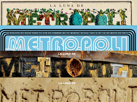
Publications normally put subjects on their front covers and adapt them to the form of their magazines. Metrópoli tries to do the opposite, giving its front cover over to the subject to take on the form and texture of the subject in question. If no two issues are the same, no two front covers should be the same. The most important thing is the story being told, not the magazine. We print it but it is not ours; we are not the protagonists.
Our duty as communicators is to tell the subject’s story. Perseverance and consistency make a product identifiable over time, not the magazine’s name. That name must act as part of the front cover, not be a distant observer of what is going on underneath. Integration is also information.
After that, the secret is to have a bit of fun, punch some emotion into it and care about your work. Always strive to be better and more audacious, to go to places others don’t dare. Do what the competition never does (or doesn’t know how to) and think about how you can surprise your readers and yourself. The magazine is the magazine but the subjects on the front are unique, so why should we treat them all the same?
Equality is sometimes the biggest inequality, the biggest injustice and, in journalism, the biggest mistake. Every subject deserves its fifteen minutes of glory. Our work does not have rules or conventions and does not follow specific steps; there are no pre-defined long-term guidelines.
Our flag is eclectic and it is hard to define borders between styles, approaches and professional trends. Everything goes: screaming, whispering, caressing or singing, and we use a full range of colours, shapes, sizes, illustration, photography and typography to achieve that end. We are flexible and unpredictable. The following six examples broadly represent “the Metrópoli style” and include illustration, photography, typography, material and a sense of humour.
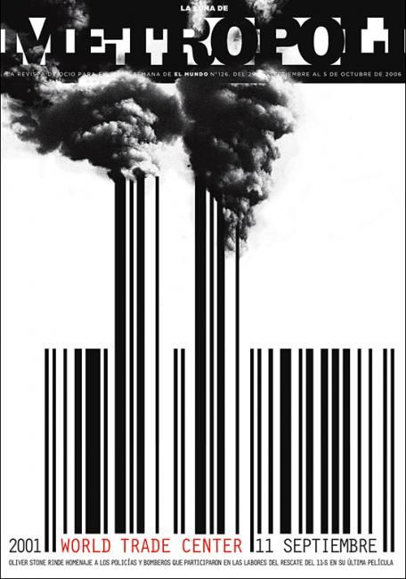
1. WORLD TRADE CENTER
Probably our most iconic front cover. The smoking towers turning into a bar code provide a very strong image. The bar code is a graphic way to represent commerce and the economy, the world business centre that were the Twin Towers. The headline is part of that code.
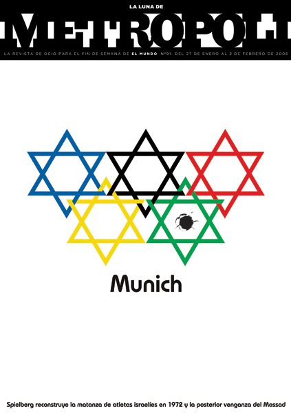
2. MUNICH
This front cover is almost perfect. The possibility of bringing together three concepts in such a simple and emphatic way was unique. The five Olympic rings, the Star of David and the single shot.
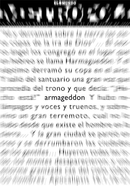
3. ARMAGEDDON
We wanted to bring movement to the front cover. A simple Photoshop filter gave us speed and depth for the Biblical Apocalypse text. Only the title of the film is still. The front cover became the meteorite racing towards the Earth.
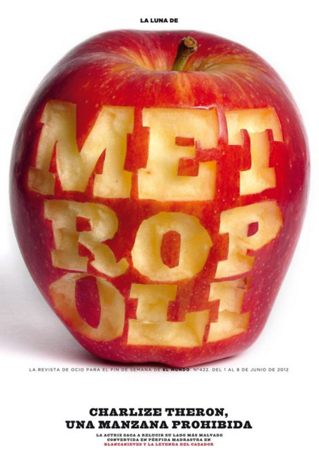
4. SNOW WHITE
The protagonist of our front cover was neither Snow White, the evil stepmother or the dwarves. It was the apple, seven of them like the seven dwarves, but ‘Metrópoli’ is nine letters, so we ate a couple more.
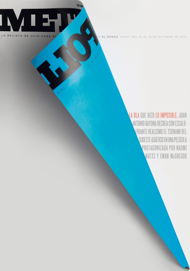
5. THE IMPOSSIBLE
The wave is the main axis of the film: it causes the whole plot, drags everything in its wake and generates the catastrophic landscape. Our own cover had to become that wave. Half of the cover balanced by the other half. The impossible.
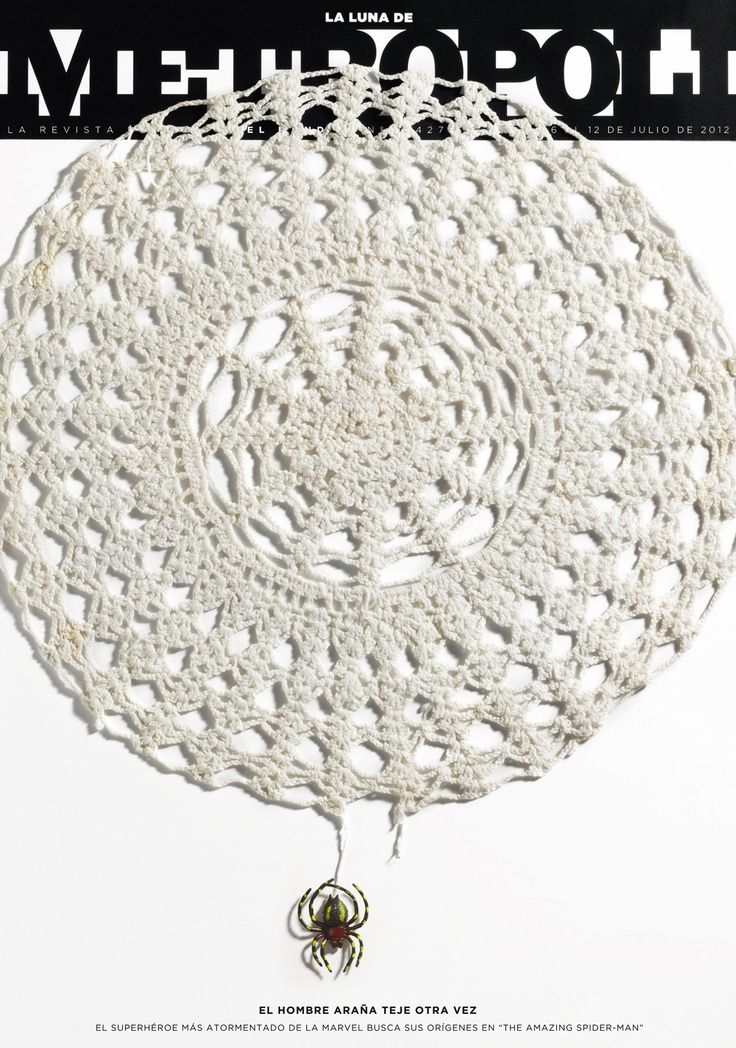
6. THE AMAZING SPIDERMAN
We took spider webs to the extreme, beyond even, given he’s half man. Simple, daily ideas that become iconic when mixed together.
Rodrigo Sanchez is the Art Director for Madrid weekly newspaper, El Mundo, as well as their Magazine Editorial Unit.