31 Mar NEW DIGITAL NARRATIVES: REINVENTING THE JOURNALISM STORYTELLING TOOLBOX
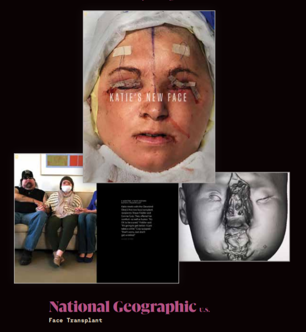
It tells the story of Katie, the youngest person in the U.S. to undergo a face transplant.
The full screen still images are shocking, the text is simple, offering the readers glimpses into Katie’s life after her injury, as well as before and after her surgery.
“This story is difficult to look at,” the piece begins, the text appearing after an image of a young woman’s sewn up face.
Videos offer more insight into the lives of Katie and those around her. It is a gripping, sobering sequence of impressions.
A writer and two photographers spent hundreds of hours over the course of two and a half years with Katie, her family and her medical team.
The main interactive feature is supplemented with further stories about the procedure and interviews with the photographers, as well as a 22-minute short film about the family’s journey.
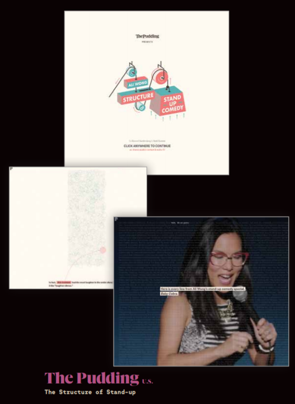
The Pudding presents itself as “a digital publication that explains ideas debated in culture with visual essays.”
In this piece, the publication pushes creativity both visually and technically.
Each piece is unique and feels crafted specifically for the story.
One essay dissects and analyses a stand-up show by comedian Ali Wong, explaining how she plans her performance, and why she gets the biggest laugh from the audience when she does.
The effortless weaving of audio, graphics and narrative storytelling into the piece is this year’s example of multimedia storytelling at its best, and a creative approach in applying science to examine art.
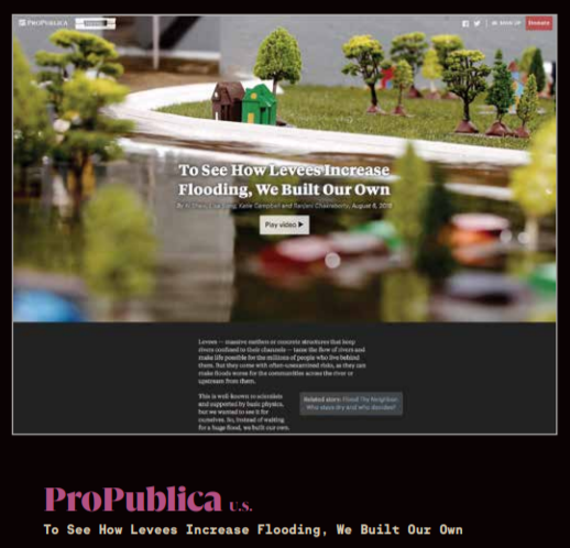
A multimedia package from ProPublica and Reveal from The Center for Investigative Reporting provides the curious reader with a thorough understanding of a technically complex phenomenon: how flood levees can endanger some areas while protecting others.
The reporting team hired engineers to build a physical model of four levee scenarios, “to see how levee height and placement choices can put surrounding communities on the floodplain… at greater risk of flooding.”As well as featuring video, diagrams and graphs,
An interactive graphic allows users to adjust the volumes of water flowing through channels in the four scenarios and see the effect on the surrounding land.
“I think the biggest challenge was, how do you make something that on the surface is as boring as levees and concrete embankments, how do you make that interesting to the general audience?” reporter Lisa Song told FIPP.
“It’s a fun challenge to think about: can you make people want to learn about something like this?”
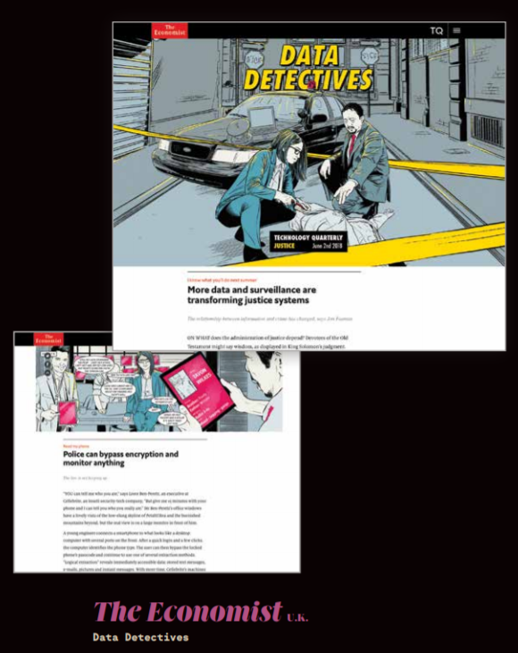
The Economist’s graphic novel Data Detectives was created for its Technology Quarterly in June 2018 which focused on the theme of justice.
It appeared in print and online, with images interspersed among the articles of the section. It was then transferred to Instagram by digital and social media picture editor Ria Jones. The platform made it ideal for a graphic story, she told FIPP:
“The multiple-picture function on Instagram offers great opportunities for visual storytelling. The ability to swipe between images seamlessly means you can really build a narrative, allowing people to engage with our content in a different way.”
The way that the images are stitched together creates a smooth swiping experience.
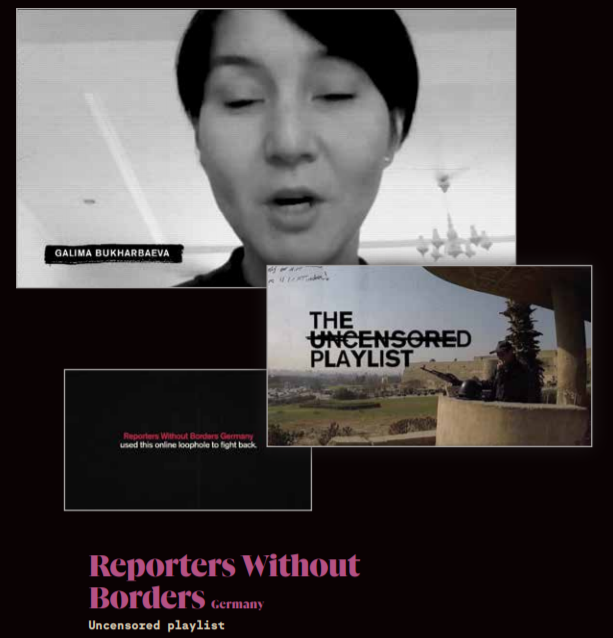
“Making free information available where press freedom is not.”
Reporters Without Borders Germany worked with five journalists from five different countries (China, Vietnam, Uzbekistan, Thailand and Egypt) whose work was being censored, to turn their work into songs which could then be listened to in their countries of origin.
The playlist of ten songs is now available on streaming platforms such as Spotify, Apple Music and Deezer.
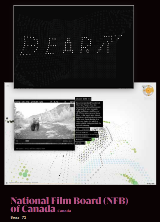
Bear 71 is a 20-minute interactive documentary from the National Film Board (NFB) of Canada, originally built using Adobe Flash in 2012, then upgraded later using Google’s WebVR API.
It allows the user to explore the world of a female grizzly bear in Banff National Park who was tagged and tracked by surveillance cameras for several years.
It features narrative from the bear’s perspective, and video clips of her and other animals, and allows the user to navigate the park.
It can be used with a Daydream View headset for a true VR experience or explored via a browser.
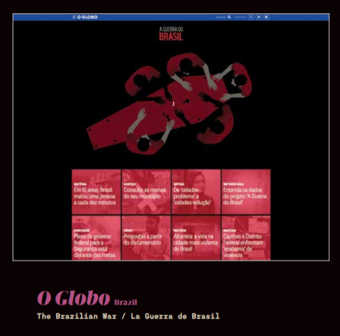
In the last 15 years, one person has been killed every ten minutes in Brazil, amounting to 786,000, more than the number killed in the wars in Syria or Iraq.
O Globo’s investigation into these shocking statistics explains and analyses the data using graphs, interviews and videos.
The paper has also built a database which allows readers to search by district to see the number of murders in specific areas.
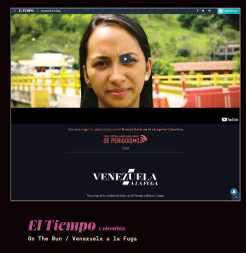
This multimedia package tells the stories of Venezuelans migrating to other Latin American countries, inspired by the fact that between 2015 and 2017 the number of Venezuelans leaving for other parts of the continent increased by 895%.
Through videos, text, photographs and moving maps focusing on individual journeys,
El Tiempo investigates the reasons they are leaving, how their journeys progress and what awaits them.
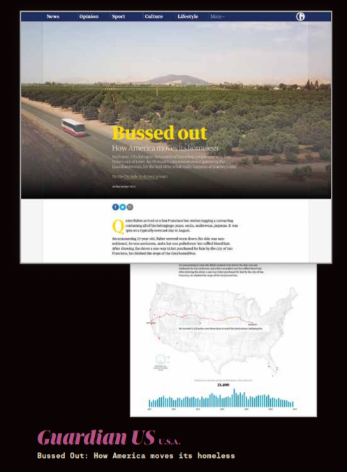
This Guardian investigation focuses on the increasingly common U.S. practice of offering homeless people free one-way bus tickets to other cities to encourage them to move elsewhere.
Over the course of 18 months, the Guardian compiled a database of around 34,240 journeys and analysed their effect on cities and people.
It uses animated maps and diagrams to demonstrate the journeys being undertaken by homeless people, where they ended up and the numbers of people involved, as well as including video interviews with those involved.
The paper also explains the methodology and the data preparation undertaken for the story, and how the data visualisations were put together.
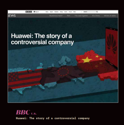
The BBC has created an impressive piece on Chinese tech firm Huawei and its involvement in the development of western 5G services using Shorthand, a storytelling platform used by media brands and others to produce visually compelling content.
Large images and parallax scrolling are used to give the impression of a vibrant, multi-layered news experience.
According to its site, Shorthand has “best-in-the-business time on page metrics, as measured by Chartbeat and our own customers.”
This article, along with many, many more is available in full, within the pages of our Innovation in News Media 2019-2020 World Report, available for purchase in print or digital edition.