11 Jul Print and Offbeat: Our Annual Dose of Human Genius and Imagination
The world is exploding with people, trends and events that could cause you to question mankind’s basic intelligence, never mind our creativity.
But every year in researching this chapter, we rediscover just how clever, creative, responsible, and caring those of us in the much-maligned media industry can be.
Almost half of our off-beat “winners” this year did their work in pursuit of the betterment of the world, a first in the 11 years we’ve been producing this chapter of FIPP’s Media Innovations book.
Here’s a preview of the provocative, inspiring, fun, creative, mind-boggling innovations to come in this chapter:
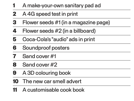
1. A MAKE-YOUR-OWN SANITARY PAD AD
Two years ago, we highlighted the Ikea print advert that some considered cringe worthy and others saw as pure genius: If a woman urinated on the ad, it would indicate if she was pregnant and, if she was, her pee also revealed a substantial discount on a baby crib!
This year, we found yet another female-targeted ad some people once again considered cringeworthy and others genius, but for different reasons.
To highlight what they called the “period poverty”crisis, the social enterprise Hey Girls UK ran a two-page ad in newspapers across the UK featuring a cut-out outline of a sanitary towel entitled Make Your Own Sanitary Pad. On the reverse side of that page, Hey Girls ran the explainer: “One in ten girls in the UK can’t afford sanitary products. Every month, they’re forced to use loo rolls, socks, or even newspapers. Help us end period poverty. For every Hey Girls box of pads you buy, we will give a free box to a girl who needs it.”
“I’m not a campaigning person who takes to the street with my placard,” Hey Girls UK founder Celia Hodson told CampaignLive.com. “It’s phenomenal if you are, but that isn’t me and it’s not the way I created Hey Girls. I wanted to create [an ad] that was striking and stopped people, but raised the question without being aggressive.”
2. A 4G SPEED TEST IN PRINT
Traditional media (aka “print”) does not lend itself to interactive marketing. Or does it? Finnish mobile operator Telia was the first in the country to offer 4G, the world’s fastest mobile connection. To promote its 4G service, the company wanted to use the country’s very strong traditional print media, but it wanted to do it in a nontraditional way. 4G is all about speed, so Telia wanted to find a way to memorably convey that speed in a print ad. What would be more memorable than an interactive, multiplayer reaction-speed game that pitted two friends against one another? The print ad became a video game when readers took a picture of the ad with their mobile phone, opened the Telia app, and placed the phone on the ad. The phone’s screen became the game board. Players would put their fingers on the print ad and when the phone screen changed colours, the challenge was to be the first to tap the screen. The ad was “one step ahead of many other interactive print ads out there,” according to Lift Magazine.
Speed is THE key point of difference of 4G networks, and this is the most enjoyable way so far to showcase the potential of the new network to consumers who will likely use it for games, apps and other trivial stuff.” Players could win a near Telia 4G connection.
3. FLOWER SEEDS IN A PRINT AD #1
This year, we had TWO ad campaigns that gave consumers free flower seeds. The first, in April in Swedish magazines, was an advert for a flower pot and was entitled This Ad Will Grow on You. And indeed it would. Printed on easily biodegradable seed-paper, the page was embedded with seeds for flowers including snapdragons, catchflies, and daisies. “Just plant this ad in a pot, put it in a sunny comer and don’t forget to water it,” the ad read. “Maybe talk to the pot every now and then. It’s no harder than that to give your home a little love this spring.”
4. FLOWER SEEDS IN A PRINT AD #2
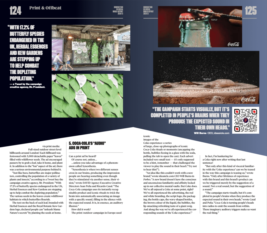
Four months later, Herbal Essences seriously upped the ante for a free flower seeds campaign via print media:
Full-sized outdoor street-level billboards around London! Each billboard was festooned with 3,000 detachable paper “leaves filled with wildflower seeds. The ad encouraged passers-by to grab a leaf, take it home, and plant it. In addition to the “fun” aspect of the ad, there was a serious environmental purpose behind it. “Just like bees, butterflies are major pollinators, controlling the population of a variety of plants and insects,” according to a Tweet buy the campaign creative agency, Mr. President. “With 17.2% of butterfly species endangered in the UK, Herbal Essences and Kew Gardens are stepping up to help combat the depleting population.” The various seeds in the leaves create wildflower habitats in which butterflies flourish. The text on the back of each leaf, branded with Herbal Essences and the Royal Botanic Kew Gardens logo, declared people can “unleash Mama Nature’s secrets” by planting the seeds at home.
5.COCA-COLA’s “AUDIO” ADS N PRINT
Can a print ad be heard?
Of course not, unless…
…unless you take advantage of a phenomenon called Synesthesia.
“Synesthesia is when two different senses cross in our brains, producing the impression people are hearing something even though they’re stimulated via another sense, their vision,” w rote DAVID Agency Executive Creative Directors Juan Pena and Ricardo Casal.“The Coca-Cola campaign uses its instantly recognisable product and iconic rituals to trick the brain into automatically associating an image with a specific sound, filling in the silence with the expected sound. It is, in essence, an auditory illusion.”
How did it work?
The print/outdoor campaign in Europe used iconic images of the Coke experience: a series of large, close-up photographs of iconic Coca-Cola rituals or moments (uncapping the bottle, bubbles fizzing in a glass with the soda, pulling the tab to open the can). Each advert included very small text — it’s only supposed to be a hint, remember — that challenged the viewer to play the sound in their head (“Try not to hear this!”).
“An idea like this couldn’t work with a new brand,” wrote ideasicle.com CEO Will Bums in Forbes. “A new brand doesn’t have the conscious and unconscious familiarity and affinity locked up in our collective mental vaults. But Coke does. We’ve all enjoyed a Coke at some point, right? We’ve all experienced the advertising, the red and w hite branding, the script logo, the packaging, the bottle caps, the wavy-shaped bottles, the brown colour of the liquid, the bubbles, the lip-smacking refreshing taste of a giant swig.
And along the way we’ve all experienced the corresponding sounds of the ‘Coke experience’.” In fact, I’m hankering for a Coke right now after writing that last sentence!
“But only after this kind of visceral familiarity with the ‘Coke experience’ can we be teased in the way this campaign is teasing us “wrote Bums. “Only after lifetimes of experience with this brand and this brand’s product can we be triggered merely by the suggestion of a sound. Not a real sound, but the suggestion of a sound.” “The campaign starts visually, but it’s completed in people’s brains when they produce the expected sound in their own heads,” wrote Casal and Pena. “Coca-Cola is turning people’s heads into radios to emit the sounds from within. These imaginary auditory triggers make us want the real thing.”
6. SOUNDPROOF POSTERS
OK, technically, this is not a print innovation.
It’s an innovation by a print and digital publication that is just really, really cool. And a great way to raise the brand’s awareness among the toughest demographic for legacy media brands: young people.
Rolling Stone in Brazil has been migrating from its traditional print format to print and digital while expanding its scope and target audience. To increase engagement and increase its follower base, it came up with the idea of a contest for young musicians and their friends.
What do young musicians really like and need: Cool posters and soundproofing for their practice spaces (often their bedrooms, so this contest appealed to parents and neighbours as well!).
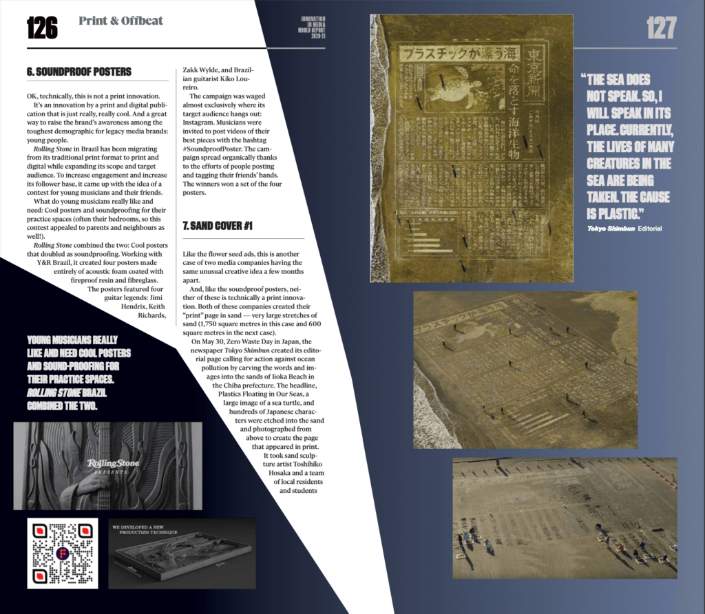
Rolling Stone combined the two: Cool posters that doubled as soundproofing. Working with Y&R Brazil, it created four posters made entirely of acoustic foam coated with fireproof resin and fibreglass. The posters featured four guitar legends: Jimi Hendrix, Keith Richards, Zakk Wylde, and Brazilian guitarist Kiko Loureiro.
The campaign was waged almost exclusively where its target audience hangs out: Instagram. Musicians were invited to post videos of the-best pieces with the hashtag #SoundproofPoster. The campaign spread organically thanks to the efforts of people posting and tagging their friends’ bands. The winners won a set of the four posters.
7. SAND COVER #1
Like the flower seed ads, this is another case of two media companies having the same unusual creative idea a few months apart.
And, like the soundproof posters, neither of these is technically a print innovation. Both of these companies created then-print” page in sand — very large stretches of sand (1,750 square metres in this case and 600 square metres in the next case).
On May 30, Zero Waste Day in Japan, the newspaper Tokyo Shimbun created its editorial page calling for action against ocean pollution by carving the words and images into the sands of Iioka Beach in the Chiba prefecture. The headline, Plastics Floating in Our Seas, a large image of a sea turtle, and hundreds of Japanese characters were etched into the sand and photographed from above to create the page that appeared in print.
It took sand sculpture artist Toshihiko Hosaka and a team of local residents and students 11 days to complete the “page” Here is an excerpt from the editorial: “The sea does not speak. So, I will speak in its place. Currently, the lives of many creatures in the sea are being taken. The cause is plastic. Plastic bags, plastic bottles, styrofoam…
8 million tons of plastic used in everyday life are dumped in places like rivers and the ocean every year, and remain floating as garbage. By swallowing or being entangled in plastic garbage, about 700 species of animals including sea turtles, seabirds, seals, and fish are harmed and killed.
“We Japanese are also largely responsible. Japan produces the second most garbage per person. In order to rectify this, we have to take a good hard look at what is happening in the ocean. We need to think about things we have been ignoring as a result of prioritising economic growth, everyday convenience, and such.”
8. SAND COVER #2
Just three months later, Hosaka was at it again and once more in Iioka, but this time he was creating the cover for the TIME magazine Climate Change Edition.
This 600-square-metre “cover” took Hosaka and a seven-person team 14 days, including several days when the temperatures hit almost 36 degrees Celsius and Typhoon Krosa threatened to wash their work away (it veered off in another direction).
We sculpt letters, frames, and earth parts using shovels, forks, and rakes used for gardening,” said Hosaka in a TIME story about the cover. “It was necessary to always moisten because if the ground was dry it did not form.
It is a huge task. I carved it a little and shot it with a drone to adjust the balance and depth. A dust spray is sprayed thinly on the finished part. This spray is used for road construction. This will withstand some rain and dryness.”
9. A 3D COLOURING ROOK
We admit that this is not a print innovation many (any?) of you will be rolling out any time soon, but it does get you thinking about the future possibilities for print and digital integration.
It started
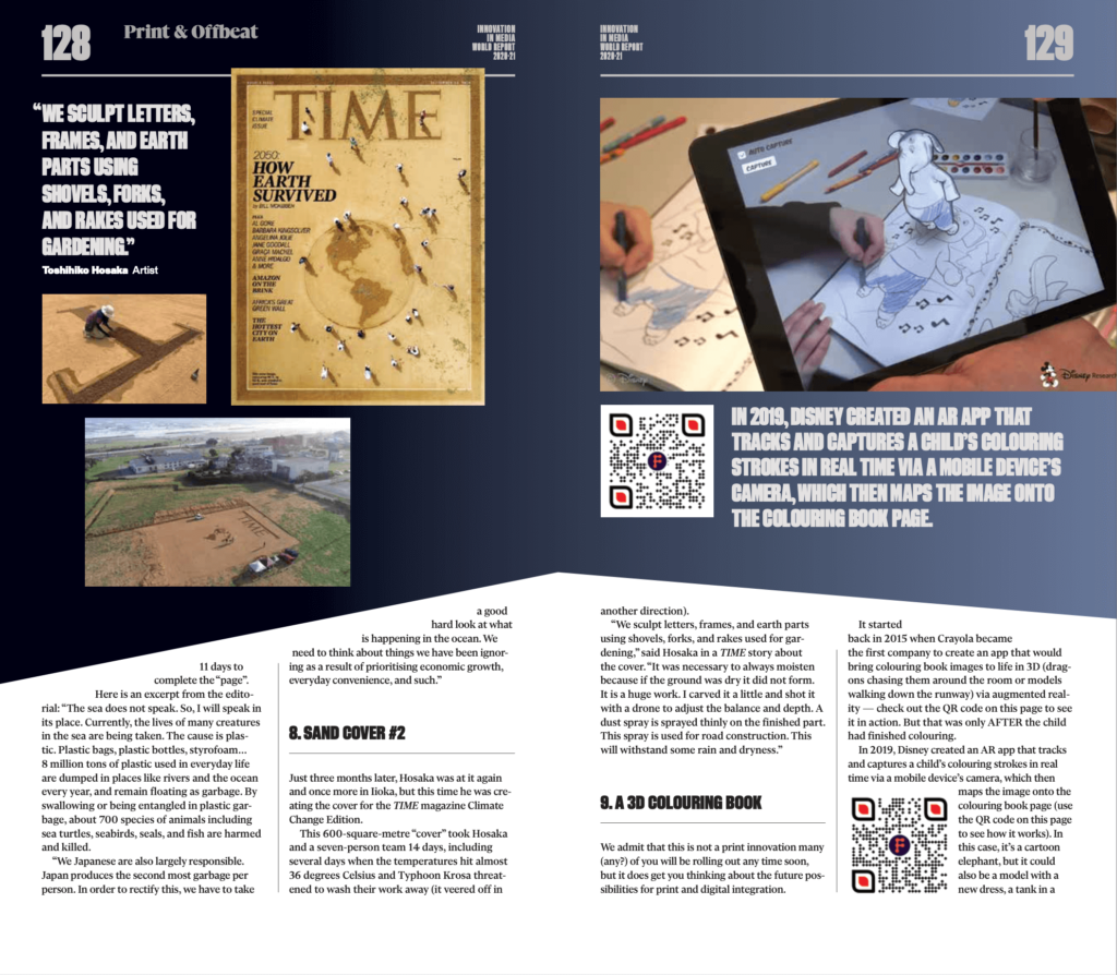
back in 2015 when Crayola became the first company to create an app that would bring colouring book images to life in 3D (dragons chasing them around the room or models walking down the runway) via augmented reality — check out the QR code on this page to see it in action. But that was only AFTER the child had finished colouring.
In 2019, Disney created an AR app that tracks and captures a child’s colouring strokes in real time via a mobile device’s camera, which then maps the image onto the colouring book page (use the QR code on this page to see how it works). In this case, it’s a cartoon elephant, but it could also be a model with a new dress, a tank in a battle, a Star Wars scene, etc. At the end of 2019, the app was still in development, so don’t go looking to get it for your child or grandchild quite yet.
10. THE NEW CAR SMELL ADVERT
This is going from the sublime to the ridiculous. But who doesn’t love the smell of a new car, right?
Not unlike the Coca-Cola ad utilising the sense of sound in a print ad, Liberty Mutual Insurance Company used the sense of smell in its new print ad campaign.
Full disclosure here: Guess what? Liberty Mutual isn’t the first company to use the new-car fragrance in a print ad. As a matter of fact, way back in 1987, Rolls-Royce was the first car company to embed a new-car smell into a print ad.
And, yes, we admit that smell has been used in print magazines forever, almost entirely by fragrance companies (there were those popcorn-scented ads in Australian newspapers).
In a 2011 GfK MRI Starch Advertising Research study of 6,514 magazines over a period of four months, researchers found only 49 scented page ads, mostly for cosmetics, household cleaners, personal hygiene, and medicines. They also found that scented ads do, indeed, garner more consumer attention than regular ads. Liberty Mutual wanted to jog readers’ fond memories of when they buy a new car… and have to consider new auto insurance. “If you’re thinking about a new car, think about Liberty’ Mutual,” read the ad.
So, while it’s not exactly new, the Liberty Mutual ad does raise the question of how else might scent be used in ads and in stories: Why shouldn’t a camping outfit infuse the smell of a campfire and pine trees into an ad for tents and sleeping bags? Or a book store infuses the smell of a new book? Or a coffee shop infuses the intoxicating smell of newly ground coffee beans? Or a recipe for BBQ in a food magazine uses the smell of mesquite coals and BBQ sauce? Or a gardening magazine infuses the smell of various roses in a feature about rose gardens?
11. A CUSTOMISABLE COOKBOOK
When you have an adoring audience of 325 million, you’d be an idiot to not try to take advantage of their affection for your brand and your content with branded products, especially when your niche is cooking.
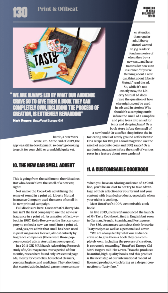
Meet BuzzFeed’s 100% customisable cookbook!
In late 2019, BuzzFeed announced the launch of My Tasty Cookbook, first in English but soon in German, French, Spanish, and Portuguese.
For $36, consumers can select their favourite Tasty recipes as well as a personalised cover.
“We are always led by what our audience craves so to give them a book they can completely own, including the process of creation, is extremely rewarding,”BuzzFeed Europe GM Mark Rogers told The Drum. “Hacche produces beautiful, high-quality books and this product is the next step of our international rollout of licensed products, which bring us a deeper connection to Tasty fans.”


