

08 Feb CUTTING-EDGE DATA JOURNALISM FROM AROUND THE GLOBE
The main aim of data journalism is, or should be, the same as non-data journalism:
to tell the most interesting and relevant stories to readers in the most efficient way possible.
Data journalism has been done in newspapers for many years, but the growing options offered by the digital world in terms of collecting information, slicing it up and presenting it in some attractive way to readers mean we are living through a golden age for this type of journalism.
To this we must add the launch over the past twelve months of several digital reporting projects that are betting on data, which has encouraged even more newspapers to jump on the bandwagon. Amongst the new projects, the most relevant are FiveThirtyEight and Vox.
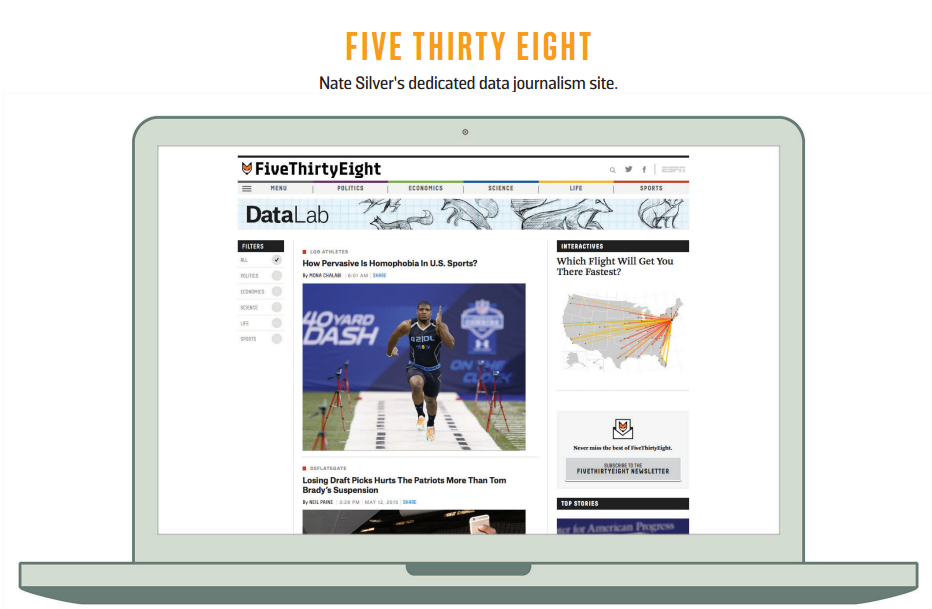
FiveThirtyEight is a very visual, interactive data journalism project, created and edited by Nate Silver, and protected by ESPN. Silver became famous thanks to his New York Times blog of the same name, where he predicted the results of several elections with great precision, including the last presidential election. An agreement was not reached for him to continue at the newspaper, so he launched the new site, and recruited some 20 specialist journalists to staff the operation.
Vox, a Vox Media site, was set up by another journalist, Ezra Klein, who also left a great newspaper, The Washington Post. Vox’s main aim is to help readers better understand the news. To do that, Vox uses all sorts of data, graphs and applications alongside new formats like cards. The scope and momentum the site gained in its first year alone seems to provide proof of the warm welcome and legitimacy that the public is giving this kind of journalism.

-THE NEW YORK TIMES REACTS-
The New York Times did not sit around on its hands as it watched one of its star journalists leave. It commissioned one of its most respected journalists—Pulitzer Prize winner and former Washington Bureau chief David Leonhardt—to ready a new project. The Upshot is a new space for news, analysis and data visualisation, launched in April 2014, with the main aim of “helping readers to understand the news”, as a Times article explained by way of presentation.

The article described the need to write very directly and simply to make it easy for readers to understand the issues and get the most from the large amounts of digital data the Internet makes available: “One of our highest priorities will be unearthing data sets — and analysing existing ones — in ways that illuminate and explain the news”.
The Upshot team has data visualisation specialists who had already taken part in some of the papers’ most successful interactive projects, like a survey on the way people talk—which was The Times’ most visited piece of content in 2013, and among the most visited in 2014—or the tool to help someone decide if they are better off buying or renting a house.
During their first year of activity, The Upshot team worked on lots of projects that seem to have been welcomed by Times readers. Many of them made it into the daily, weekly, monthly or even yearly ‘most read’ sections. “Where Are the Hardest Places to Live in the U.S.?”—a graphical analysis of living standards in every US county—was the tenth most visited piece of content in 2014.
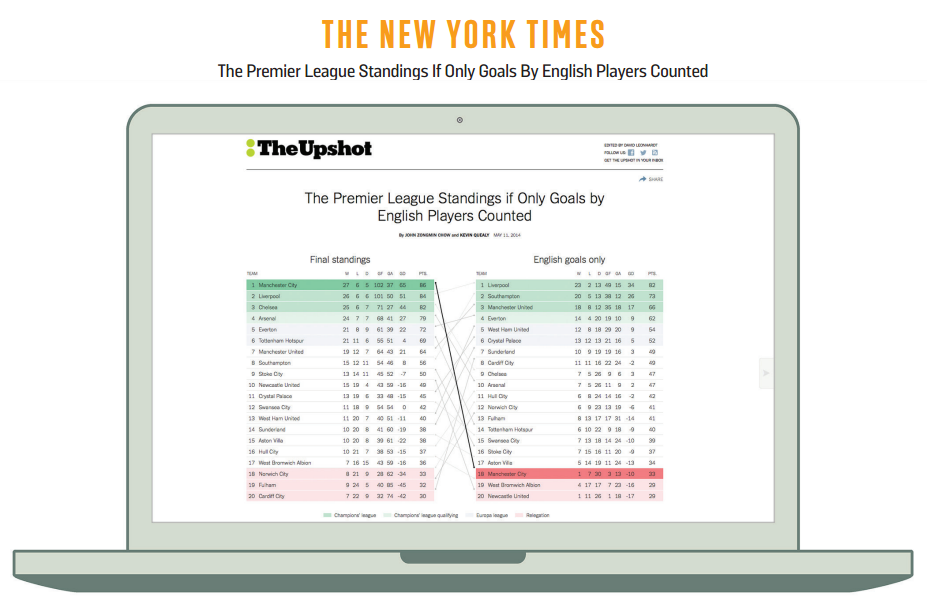
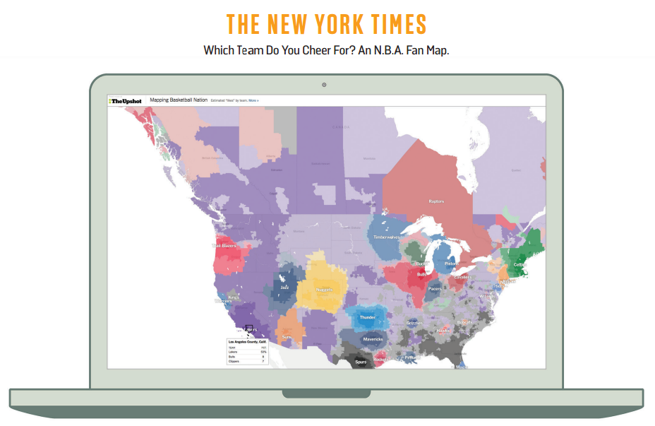
Other Upshot content—such as “The Premier League Standings If Only Goals By English Players Counted” or “Mapping Migration in the United States” [since 1900]—has triumphed on social media and readers loved the sports data stories “A Map of Baseball Nation”, “Which Team Do You Cheer For? An N.B.A. Fan Map” and “N.C.A.A. Fan Map: How the Country Roots for College Football”.

The Upshot team has made extensive use of photography to present information efficiently, such as with the “What 2,000 Calories Looks Like” project, produced with images of the different menu combinations offered by leading restaurant chains in the United States.
The “Who Will Win The Senate” interactive feature and “The American Middle Class Is No Longer the World’s Richest” story on the evolution of the purchasing power of the American middle class also deserve a special mention.
On top of The Upshot’s work, The Times has given us with the occasional master class in data visualisation, like when it produced its “Reshaping New York” feature to explain urban change in New York City during the twelve-year tenure of Mayor Michael Bloomberg.

-THE GUARDIAN-
The data team at British newspaper The Guardian is one of the longest-serving and active in the field of data journalism. Their Datablog continues to be one of the leading references for almost all of the journalists around the world who are interested in working with data and making it visual in some way.
Roughly 20 people work on The Guardian’s data team. Thanks to the quality of their work and high output, data journalism has become one for the most distinctive elements of the online activity of the British newspaper.
One of the most spectacular pieces of 2014 was a project on the situation with lesbian, gay, bisexual and transexual rights around the world.

-THE WALL STREET JOURNAL-
For a newspaper like The Wall Street Journal, where economic information is an absolutely essential part of its offer, working with data is obviously not new. Its journalists are used to analysing all types of data, but the paper still offers specialist training in this field.
On WSJ.com, news stories that use databases and different data visualisations to better tell the story are more and more frequent. More than a special space dedicated to data journalism, the newspaper is trying to spread the philosophy across all of its work. Last year, in fact, they created a team of investigative journalists and data experts to work together.
One of the newspaper’s ongoing blogs is “Numbers”, where they analyse and explain in detail the numbers behind all sorts of news stories.
-LA NACIÓN-
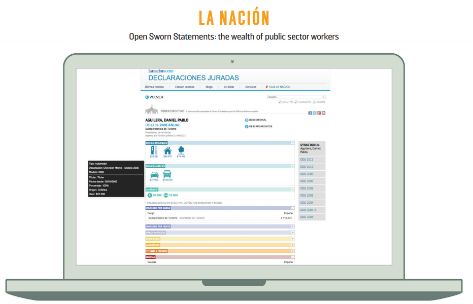
Argentinian daily, La Nación, has a core five-person team producing a special space dedicated exclusively to data journalism. La Nación Data Team leader, Momi Peralta Ramos, says it is important to share knowledge, “To infect the whole newsroom and all the editors and journalists so they exchange subject-matter knowledge from other sources to cross-check data and enrich stories.”
Ramos says her team, “…Stands out with the way we evaluate public data as raw material to tell stories, check others and provide proof for the broader investigative journalism that comes out of the data.” La Nación does not have a fixed publishing schedule for its data work. “Open sworn statements” was a very well documented prize-winning project on the wealth of public sector workers in Argentina that was developed by La Nación together with several other organisations.
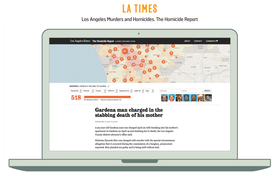
-LOS ANGELES TIMES –
The LA Times is another paper that bet a long time ago on data journalism. Among the abundant, exquisite work produced by Ben Walsh’s “Data Desk” team, “The Homicide Report”—an interactive map that lets people visualise information about all of the murders carried out in Los Angeles since the year 2000— is legendary. “Concrete Risks”, on the risks more than a thousand buildings in LA face if a big earthquake strikes, is also worth highlighting. Ben Walsh said there weren’t any hard and fast rules about how many people you need on a data journalism team: “The key is that you have people with computer programming skills in the newsroom partnering with reporters and editors who want to make data stories happen. In some cases, big things can happen with only one nerd.”
-ZEIT ONLINE-
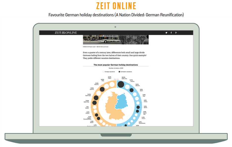
Zeit Online, the website of German newspaper Die Zeit, has been doing data journalism for some time. Among its greatest work over the past twelve months is “A Nation Divided”, which analysed the reality of German reunification with graphs, statistics and images, and which the paper published in both German and English.
HOW TO GET STARTED WITH DATA JOURNALISM
Aron Pilhofer, executive director of digital at The Guardian, and the former head of the interactive team at The New York Times, is possibly one of the most authoritative people in the world to offer advice on how a newspaper can take its first forays in the world of data journalism. These are the basic recommendations Pilhofer gave Innovation at 2015 WAN-IFRA conference:
• MANAGEMENT SUPPORT
It is essential to be able to count on the support from the newspaper’s top leadership. Without it, any effort will be in vain.
• INTEGRATED
The data journalism team must be completely integrated in the newsroom. It cannot be, for example, an isolated team in the technical department.
• SENIOR JOURNALIST
Ideally, the team must be led by an experienced journalist who is familiar with data journalism. It is not essential for him to completely master the technology.
• SUPPORT THE NEWSROOM
The team must help the whole newsroom work with data and integrate the resulting information across news stories, not only in those put together by the data team.
• SMALL TEAM
A small-sized team is ideal to begin with. The basic team could be made up of three people: the journalist leading the team, a specialist data editor and a designer who knows how to program.
• OPEN TOOLS
There are free or very cheap tools online—like Google Spreadsheets—that can be used to treat and visualise data.
• START SLOWLY
A big mistake you can make is wanting to begin with big projects. This strategy normally fails and can ruin the whole project. It’s better to go step-by-step, starting with simple projects and tackle more ambitious initiatives later on.
–INNOVATION’S TAKE-
Tsunamis of data sloshing around the globe are a fundamental aspect of the new media environment and data journalism offers a chance to illustrate stories, to be the story and to speak truth to power in a new way around the world on issues that affect us all.