
01 Dec Innovation in visual – Digital Storytelling
For all the problems that media companies faced during the Coronavirus pandemic, a lack ¡of creativity was not one of them.
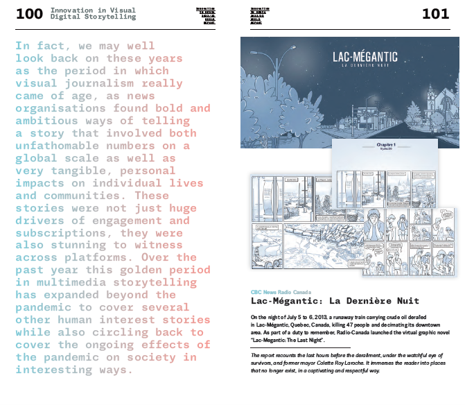
Lac-Mégantic: La Dernière Nuit
On the night of July 5 to 6, 2013, a runaway train carrying crude oil derailed
in Lac-Mégantic, Quebec, Canada, killing 47 people and decimating its downtown area. As part of a duty to remember, Radio-Canada launched the virtual graphic novel “Lac-Megantic: The Last Night”.
The report recounts the last hours before the derailment, under the watchful eye of survivors, and former mayor Colette Roy Laroche. It immerses the reader into places that no longer exist, in a captivating and respectful way.
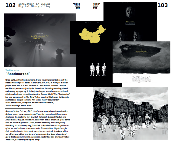
“Reeducated”
Since 2016, authorities in Xinjiang, China have implemented one of the most advanced police states in the world. By 2018, as many as a million people were held in a vast network of “reeducation” centres. Officials used broad pretexts to justify the detentions, including travelling abroad and owning a prayer rug. It is likely the largest mass-internment drive of ethnic and religious minorities since the Second World War. “Reeducated” is a two-part project by The New Yorker covering this human rights crisis and features the publication’s first virtual-reality documentary
of the same name, along with an immersive interactive,
“Inside Xinjiang’s Prison State.”
Released in late February 2021, the documentary brings viewers inside a Xinjiang prison camp, reconstructed from the memories of three former detainees. To create the film, Orynbek Koksebek, Erbaqyt Otarbai, and Amanzhan Seituly, all ethnically Kazakh men and ex-prisoners of the camp who are now living outside China, shared testimony about the facility, describing in detail everything from their daily schedules and experiences of torture to the distance between beds. The artist Matt Huynh brought their recollections to life in stark, evocative pen-and-ink drawings, which were then assembled by a team of animators into a three-dimensional space that allows viewers to experience a detention cell, an indoctrination classroom, and other parts of the camp.
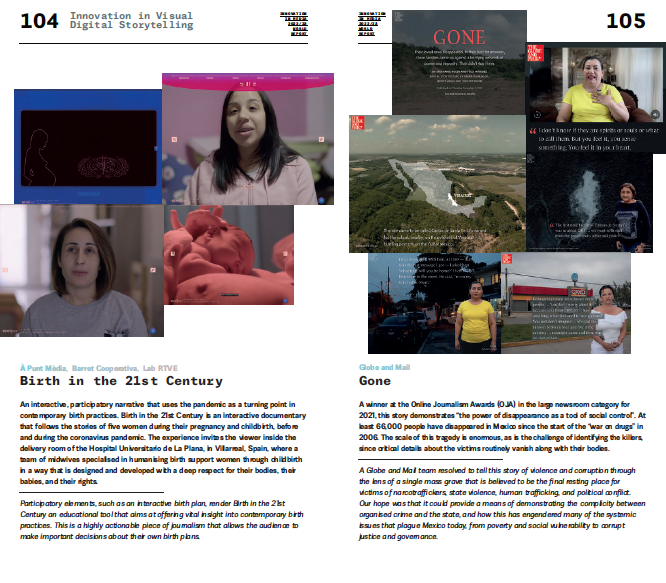
À Punt Mèdia, Barret Cooperativa, Lab RTVE
Birth in the 21st Century
An interactive, participatory narrative that uses the pandemic as a turning point in contemporary birth practices. Birth in the 21st Century is an interactive documentary that follows the stories of five women during their pregnancy and childbirth, before and during the coronavirus pandemic. The experience invites the viewer inside the delivery room of the Hospital Universitario de La Plana, in Villarreal, Spain, where a team of midwives specialised in humanising birth support women through childbirth in a way that is designed and developed with a deep respect for their bodies, their babies, and their rights.
Participatory elements, such as an interactive birth plan, render Birth in the 21st Century an educational tool that aims at offering vital insight into contemporary birth practices. This is a highly actionable piece of journalism that allows the audience to make important decisions about their own birth plans.
Globe and Mail
Gone
A winner at the Online Journalism Awards (OJA) in the large newsroom category for 2021, this story demonstrates “the power of disappearance as a tool of social control”. At least 66,000 people have disappeared in Mexico since the start of the “war on drugs” in 2006. The scale of this tragedy is enormous, as is the challenge of identifying the killers, since critical details about the victims routinely vanish along with their bodies.
A Globe and Mail team resolved to tell this story of violence and corruption through the lens of a single mass grave that is believed to be the final resting place for victims of narcotraffickers, state violence, human trafficking, and political conflict. Our hope was that it could provide a means of demonstrating the complicity between organised crime and the state, and how this has engendered many of the systemic issues that plague Mexico today, from poverty and social vulnerability to corrupt justice and governance.
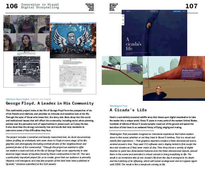
Univision News Digital, Spanish and English
George Floyd, A Leader in His Community
This multimedia project looks at the life of George Floyd from the perspective of six of his friends and relatives, and provides an intimate and sensitive look at his life. Through the eyes of those who knew him, the story also dives deep into the social and institutional issues that still affect his community, including racist urban planning policies and the pervasive lack of opportunities in places such as Cuney Homes.
It also describes the strong community ties and bonds that help residents to overcome some of the difficulties they face.
The project includes a narrative and heavily researched text, six short documentary videos profiling six individuals who were close to Floyd at some stage of his life, graphics and photography (including archival photos of the neighbourhood and polaroid photos of the community). “Through this project we wanted to offer our readers a nuanced look at the life of George Floyd, as an opportunity to also examine larger issues of injustice faced by Black communities in the US. This was a particularly important project for us to create, given that our audience is primarily Hispanic and immigrant, and very few projects of this kind have been published in Spanish,” Univision submitted at the OJA awards
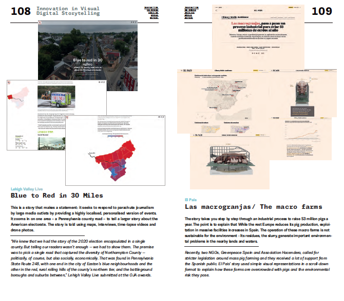
Washington Post
A Cicada’s Life
Here’s a wonderfully executed wildlife story that draws upon digital visualisation to take the reader into a unique world. Every 17 years in many parts of the eastern United States, hundreds of billions of Brood X cicada nymphs crawl out of the ground and spend the last sliver of their lives in an awkward frenzy of flying, singing and mating.
Washington Post journalists imagined an immersive experience that takes readers close to this event, whether or not they lived in Brood X territory. This is a visual and mobile-first experience — Post graphics reporters created a three-dimensional scene, centred around a tree. They used 3-D software and a display tablet to first sculpt the tree and cicadas as if they were made of clay. Then they chose a variety of digital brushes to paint two-dimensional textures onto the three-dimensional objects, placed them in the scene and animated a virtual camera to bring everything to life. The result is an immersive tale of one cicada’s life from the day it emerged to its death and the hatching of its offspring, which will tunnel underground and not appear again until 2038. The result is like a storybook coming to life.
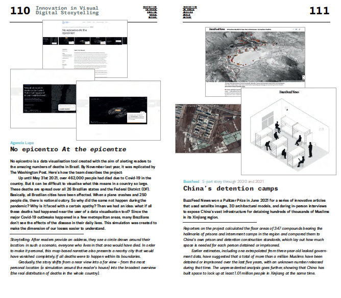
Lehigh Valley Live
Blue to Red in 30 Miles
This is a story that makes a statement: it seeks to respond to parachute journalism by large media outlets by providing a highly localised, personalised version of events. It zooms in on one area – a Pennsylvania county road – to tell a larger story about the American electorate. The story is told using maps, interviews, time-lapse videos and drone photos.
“We knew that we had the story of the 2020 election encapsulated in a single county. But telling our readers wasn’t enough — we had to show them. The premise was to pick a single road that captured the diversity of Northampton County — politically, of course, but also socially, economically. That was found in Pennsylvania State Route 248, with one end in the city of Easton’s blue neighbourhoods and the other in the red, rural rolling hills of the county’s northern tier, and the battleground boroughs and suburbs between,” Lehigh Valley Live submitted at the OJA awards.
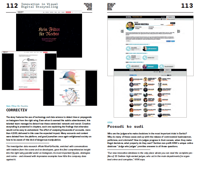
El Pais
Las macrogranjas/ The macro farms
The story takes you step by step through an industrial process to raise 53 million pigs a year. The point is to explain that While the rest Europe reduces its pig production, exploitation in massive facilities increases in Spain. The operation of these macro farms is not sustainable for the environment – Its residues, the slurry, generate important environmental problems in the nearby lands and waters.
Recently, two NGOs, Greenpeace Spain and Association Hacendera, called for stricter legislation around mass pig farming and they received a lot of support from the Spanish public. El Pais’ story used simple visual representations in a scroll-down format to explain how these farms are overcrowded with pigs and the environmental risk they pose.
Agencia Lupa
No epicentro At the epicentre
No epicentro is a data visualisation tool created with the aim of alerting readers to the amazing numbers of deaths in Brazil. By November last year, it was replicated by The Washington Post. Here’s how the team describes the project:
Up until May 31st 2021, over 462,000 people had died due to Covid‑19 in the country. But it can be difficult to visualise what this means in a country so large. These deaths are spread over all 26 Brazilian states and the Federal District (DF). Basically, all Brazilian cities have been affected. When a plane crashes and 250 people die, there is national outcry. So why did the same not happen during the pandemic? Why is it faced with a certain apathy? Then we had an idea: what if all these deaths had happened near the user of a data visualisation tool? Since the major Covid‑19 outbreaks happened in a few metropolitan areas, many Brazilians don’t see the effects of the disease in their daily lives. This simulation was created to make the dimension of our losses easier to understand.
Storytelling: After readers provide an address, they see a circle drawn around their location: in such a scenario, everyone who lives in that area would have died. In order to make it personal, this map-based narrative also presents a nearby city that would have vanished completely, if all deaths were to happen within its boundaries.
Gradually, the story shifts from a near view into a far view – from the most personal location (a simulation around the reader’s house) into the broadest overview (the real distribution of deaths in the whole country).
Buzzfeed 5-part story through 2020 and 2021
China’s detention camps
BuzzFeed News won a Pulitzer Prize in June 2021 for a series of innovative articles that used satellite images, 3D architectural models, and daring in-person interviews to expose China’s vast infrastructure for detaining hundreds of thousands of Muslims in its Xinjiang region.
Reporters on the project calculated the floor areas of 347 compounds bearing the hallmarks of prisons and internment camps in the region and compared them to China’s own prison and detention construction standards, which lay out how much space is needed for each person detained or imprisoned.
Earlier estimates, including one extrapolated from three-year-old leaked government data, have suggested that a total of more than a million Muslims have been detained or imprisoned over the last five years, with an unknown number released during that time. The unprecedented analysis goes further, showing that China has built space to lock up at least 1.01 million people in Xinjiang at the same time.
Kein Filter für Rechts
CORRECTIV
The story features the use of technology and data science to detect bias or propaganda on Instagram from the right wing. Even when it seemed like subtle advertisement, this talented team managed to detect how these extremists’ network and recruit. Creative storytelling is presented in chapters, each one explaining the findings that otherwise would not be easy to understand. The effort of analysing thousands of accounts, more than 4,500, delivered in this case the expected impact: Many accounts and content were deleted from the platform, and good journalism once again enlightened society on how to be aware of this kind of dangerous manipulation.
The investigative data research #KeinFilterFürRechts, enriched with conversations with insiders from the scene and ex-developers, gave the first comprehensive insight into the right-wing parallel world on Instagram, its most important figures, strategies and codes – and showed with impressive examples how little the company does against it.
KRIK
Prosudi ko sudi
Who are the judges who make decisions in the most important trials in Serbia? Why do many of those cases end up with the release of controversial businessmen, politicians, and criminals? How do judges progress in their careers, when they make illegal decisions, what property do they own? Serbian non-profit KRIK’s unique online database “Judge who judges“ provides answers to all these questions.
“Our new innovative database is the only place where you can read the complete profiles of 33 Serbian high-ranked judges, who act in the main departments for organised crime and corruption,” KRIK says.
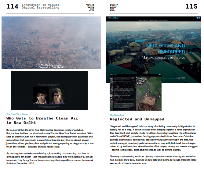
The New York Times
Who Gets to Breathe Clean Air
in New Delhi
It’s no secret that the air in New Delhi carries dangerous levels of pollution. But just how bad has the situation become? In the New York Time’s excellent “Who Gets to Breathe Clean Air in New Delhi” project, the newspaper both quantified and personalised that question in a powerful multimedia story that combined sensor journalism, video, graphics, data analysis and strong reporting to bring us a day in the life of two children – one poor and one middle-class.
By tracking their activities over the day – from waking to commuting to school to coming home for dinner – and measuring the pollution they were exposed to, minute-by-minute, they brought home in a visceral way the inequalities in access to clean air. Published December 2020.
The Guardian
Neglected and Unmapped
“Neglected and Unmapped” tells the story of a fishing community in Nigeria that is literally not on a map. A brilliant collaboration bringing together a news organisation (the Guardian), civil society (Code for Africa), technology enablers (OpenStreetMap and AfricanDRONE), journalism funding support (the Pulitzer Centre on Crisis Reporting), and the local community, especially young women living in the area, this project managed to not only put a community on map with first-hand drone images collected by residents, but also tell stories of its people, history, and current struggles – against local politics, state governments, as well as climate change.
The story is an alarming reminder of many such communities existing yet treated as non-existent, and a lively example of how data and technology could empower those who would otherwise never be seen.
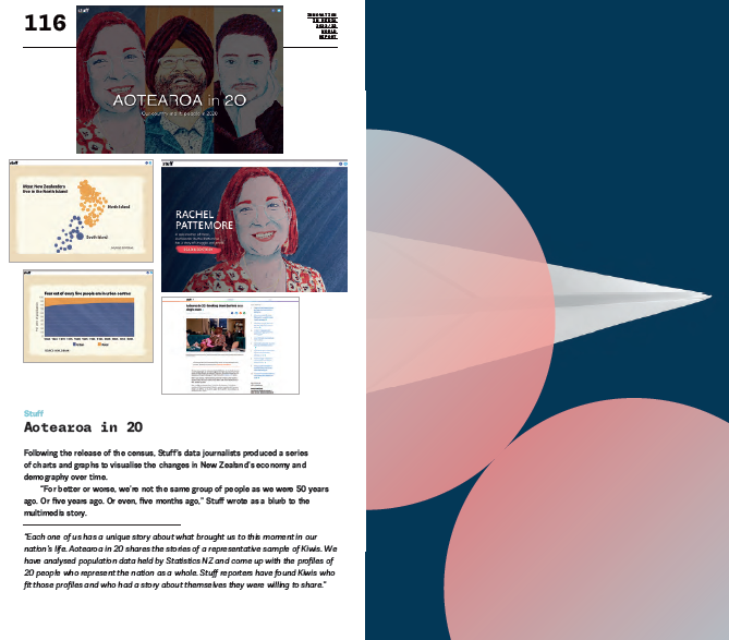
Stuff
Aotearoa in 20
Following the release of the census, Stuff’s data journalists produced a series of charts and graphs to visualise the changes in New Zealand’s economy and demography over time.
“For better or worse, we’re not the same group of people as we were 50 years ago. Or five years ago. Or even, five months ago,” Stuff wrote as a blurb to the multimedia story.
“Each one of us has a unique story about what brought us to this moment in our nation’s life. Aotearoa in 20 shares the stories of a representative sample of Kiwis. We have analysed population data held by Statistics NZ and come up with the profiles of 20 people who represent the nation as a whole. Stuff reporters have found Kiwis who fit those profiles and who had a story about themselves they were willing to share.”
The Innovation in News Media World Report is published every year by INNOVATION Media Consulting, in association with FIPP. The report is co-edited by INNOVATION Presidente, Juan Señor, and senior consultants Jayant Sriram and Inês Bravo