
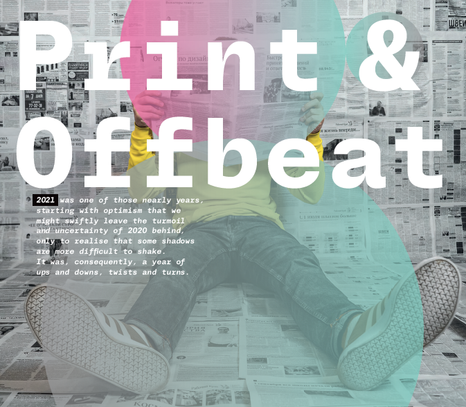
13 Dec Print & Offbeat
2021 was one of those nearly years, starting with optimism that we might swiftly leave the turmoil and uncertainty of 2020 behind, only to realise that some shadows are more difficult to shake. It was, consequently, a year of ups and downs, twists and turns
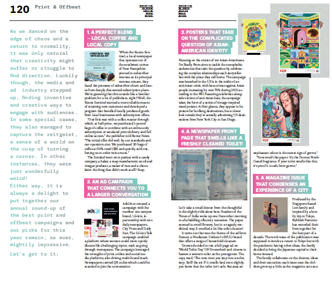
1. A PERFECT BLEND — LOCAL COFFEE AND LOCAL COPY
When the Keene Sentinel, a local newspaper that operates out of the southwest corner of New Hampshire pivoted to subscriber revenue as its principal revenue stream, they faced the pressure of subscriber churn and losses from deeply discounted subscription plans. We’re guessing that this sounds like a familiar problem for a lot of publishers, right? Well, the Keene Sentinel wanted a more reliable means of retaining new customers and developed a program that bundled locally produced goods from local businesses with subscription offers.
“Our first was with a coffee roaster through which, at half-price, we purchased 1-pound bags of coffee to combine with an online-only subscription or weekend print delivery and full online access,” the publisher told Better News. “The initial offer did well, by our standards and our operation size. We purchased 20 bags of coffee at 50% retail ($8) and quickly sold out, forcing us to order twice more.”
The Sentinel went on to partner with a candy company, a baker, a soap manufacturer, an oil and vinegar producer, a maker of rum and a chocolatier. the thing that didn’t work at all? Soap.
2. AN AD CAMPAIGN THAT CONNECTS YOU TO A LARGER CONVERSATION
Ads24 co-created a campaign with the number one tampon brand, Lil-lets, in partnership with two daily newspapers, City Press and Daily Sun. The Lil-lets Talk campaign enabled a platform where women could more openly discuss life-challenging topics, such as going through menopause. The campaign leveraged the strengths of print, online and social media platforms, also driving multi-brand reach. Newspapers carried QR codes which could be scanned to join the conversation
3. POSTERS THAT TAKE ON THE COMPLICATED QUESTION OF ASIAN- AMERICAN IDENTITY
Focusing on the stories of ten Asian-Americans, I’m Really From aims to tackle the xenophobic undertones that taint the question by celebrating the complex relationships each storyteller has with the place they call home. The campaign was launched in the US is in the midst of an anti-Asian crisis, with hate crimes against Asian people increasing by over 70% during 2021 according to the FBI. Featuring celebrities alongside victims of anti-Asian hate, the campaign takes the form of a series of vintage-inspired travel posters. At first glance, they appear to be posters for far-flung destinations, but a closer look reveals they’re actually advertising US destinations from New York City to San Diego.
4. A NEWSPAPER FRONT PAGE THAT SMELLS LIKE A FRESHLY CLEANED TOILET!
Let’s take a small detour from the thoughtful to the slightly ridiculous here. Readers of the Times of India woke up one December morning to a befuddling olfactory sensation. The paper seemed to smell flowery, but in a vaguely medicinal way. It smelled a lot like toilet cleaner!
It turns out that was the theme of the ad from Domex, a Hindustan Unilever’s (HUL) brand that offers a range of household cleaners.
Domex decided to run a full-page ad on ‘World Toilet Day’ (19 November) and choose to feature a western toilet as the protagonist. The copy read, “The next time you step into a toilet, stop. Sniff the air. If it smells bad, even slightly, you know that the toilet isn’t safe. Because an unpleasant odour is the surest sign of germs.”
“Now smell this paper. It’s the Domex FreshGuard fragrance. If your toilet smells like this, it’s proof it is safe from germs.”
5. A MAGAZINE ISSUE THAT CONDENSES AN EXPERIENCE OF A CITY
Produced by the Singapore-based Lim family and inspired by a family trip to Tokyo, Rubbish Famzine has recorded their lives together for the best part of a decade. The tenth issue of the publication was supposed to involve a return to Tokyo but with the pandemic having other ideas, the family decided to bring the Japanese capital to their home instead.
The family collaborate on the themes, ideas and their execution; each issue sees the children grow up a little as the magazine acts as a supercharged family photo album sharing their lives together – favourite TV, films, food, music…
That first issue was to be repeated for issue 10, with a group trip to Tokyo; but Coronavirus prevented travel just as they were due to leave.
The solution? Bring Tokyo to Singapore, and use the original pages of the first issue as the basis for the new issue. Stickers and rubber-stamped messages are added, new images tipped in, all in typical Rubbish FAMzine fashion.
The cover of the brilliantly OTT issue came wrapped together with a series of miniature reproductions of items the family brought back from their trip to Japan, including a Rubbish-branded Casio digital watch which is used to seal the magazine closed. Because, why not?
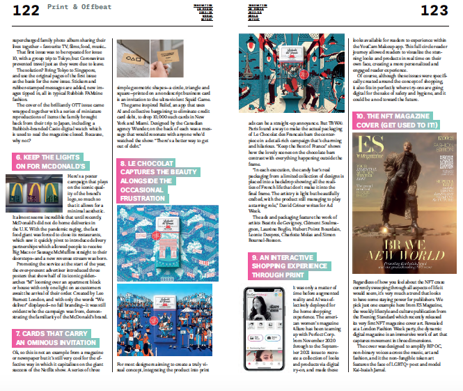
6. KEEP THE LIGHTS ON FOR MCDONALD’S
Here’s a poster campaign that plays on the iconic quality of the brand’s logo, so much so that it allows for a minimal aesthetic. It almost seems incredible that until recently, McDonald’s did not do home deliveries in the U.K. With the pandemic raging, the fast food giant was forced to close its restaurants, which saw it quickly pivot to introduce delivery partnerships which allowed people to receive Big Macs or Sausage McMuffins straight to their doorsteps—and a new revenue stream was born.
Promoting the service at the start of the year, the ever-present advertiser introduced three posters that show half of its iconic golden-arches “M” looming over an apartment block or house with only one light on as customers await the arrival of their order. Created by Leo Burnett London, and with only the words “We deliver” displayed—no full branding—it was still evident who the campaign was from, demonstrating the familiarity of the McDonald’s brand.
7. CARDS THAT CARRY AN OMINOUS INVITATION
or newspaper but it’s still very cool for the effective way in which it capitalises on the giant success of the Netflix show. A series of three simple geometric shapes—a circle, triangle and square—printed on a nondescript business card is an invitation to the ultra-violent Squid Game.
The game inspired Relief, an app that uses AI and collective bargaining to eliminate credit card debt, to drop 10,000 such cards in New York and Miami. Designed by the Canadian agency Wunder, on the back of each was a message that would resonate with anyone who’d watched the show: “There’s a better way to get out of debt.”
8. LE CHOCOLAT CAPTURES THE BEAUTY ALONGSIDE THE OCCASIONAL FRUSTRATION
For most designers aiming to create a truly visual concept, integrating the product into print ads can be a straight-up annoyance. But TBWA\Paris found a way to make the actual packaging of Le Chocolat des Francais bars the centerpiece in a detail-rich campaign that’s charming and hilarious. “Keep the Best of France” shows how the lovely scenes on the chocolate bars contrast with everything happening outside the frame.
“In each execution, the candy bar’s real packaging from a limited collection of designs is placed into a backdrop showing all the realities of French life that don’t make it into the final frame. The artistry is light but beautifully crafted, with the product still managing to play a starring role,” David Griner writes for Ad Week.
The ads and packaging feature the work of artists Beatrix de Gevigney, Clément Soulmagnon, Laurène Boglio, Hubert Poirot Bourdain, Leonie Despres, Charlotte Molas and Simon Bournel-Bosson.
9. AN INTERACTIVE SHOPPING EXPERIENCE THROUGH PRINT
It was only a matter of time before augmented reality and AI was effectively deployed for the home shopping experience. The american women’s magazine Allure has been teaming up with Perfect Corp. from November 2020 through to the September 2021 issue to recreate a collection of looks and products via digital try-on, and made these looks available for readers to experience within the YouCam Makeup app. This full circle reader journey allowed readers to visualize the stunning looks and products in real time on their own face, creating a more personalized and engaged reader experience.
Of course, although these issues were specifically created around the concept of shopping, it also fits in perfectly where try-ons are going digital for the sake of safety and hygiene, and it could be a nod toward the future.
10. THE NFT MAGAZINE COVER (GET USED TO IT!)
Regardless of how you feel about the NFT craze currently sweeping through all aspects of life it would seem, it’s very much a trend that looks to have some staying power for publishers. We pick just one example here from ES Magazine, the weekly lifestyle and culture publication from the Evening Standard which recently released its very first NFT magazine cover art. Revealed at a London Fashion Week party, the dynamic digital magazine is an immersive work of art that captures movement in three dimensions.
The cover was designed to amplify BIPOC, non-binary voices across the music, art and fashion, and it the non-fungible token art features the face of LGBTQ+ poet and model Kai-Isaiah Jamal.
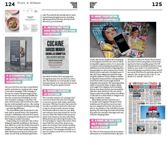
11. A COOKBOOK THAT IS QUITE LITERALLY A SCRAPBOOK
All across 2021 Ikea went big on sustainability and the environment, coming up with a range of innovative campaigns. Their campaign in Norway for instance, featured images of Ikea furniture found in trash piles and landfills that Ikea then retrieved and refurbished. An even more innovative campaign “Little Robot” depicts a droid trying to save the planet but realizing that small sustainable actions — like curbing food waste and opting for reusable grocery bags — can make big differences.
The sustainability push also involved a cookbook with an unusual theme. The ScrapsBook, created in collaboration with chefs from across North America, is dedicated to cooking with the little things we usually throw away.
Scrapcooking, if you could call it that, is about finding the beautiful possibilities in that banana peel, radish top, or even the chicken bones you’re about to toss, and make the most of everything available to you. The book includes recipes for dishes like banana peel bacon & wild rice pancakes, corn cob soup, and bruised apple butter cake. The cookbook also includes tips for reducing food waste throughout the text, including regrowing scallions, bok choy, and celery from the roots on your windowsill.
12. AN EYE TEST THAT ASKS YOU TO CHECK
the ingenious prop of an eye chart test, with a twist. The objective is to invite people to check themselves based on the way they think and see Colombia. The picture speaks for itself.
13. MAKING THE MOST OF SHUTTERS
This is another example of a campaign that’s more out-of-home than print but managed to meet the moment with simple, minimalist innovation. With bars forced to shut across Europe due to pandemic restrictions, there was no way for owners to drive revenue to keep their business afloat for almost a year. Many were having to close their shutters for the last time as a result. But Publicis Italy saw potential for those shutters to become advertising billboards instead, redirecting Heineken’s out-of home budgets to support bar owners. More than 5,000 bars turned their shutters into ads for the company’s beer brands including slogans such as, “See the ad today, enjoy this bar tomorrow.” The campaign would go on to earn the Outdoor Grand Prix at Cannes Lions in June 2021.
14. MAKE YOUR ENTIRE MAGAZINE SHOPPABLE
Anothe idea that has longsince been developing in the background and has now come to fruition is shoppable magazine content. It’s no secret that e-commerce boomed during the pandemic and publishers across the broad are integrating shopping strategies into their commerce mix. So why should it just be restricted to the digital space. In May 2021, Bauer Media partnered with image-recognition platform Phuzion Media to enhance its magazines Grazia and Heat, making products and services within its print pages instantly shoppable and interactive. The technology allows readers to point their phone or tablet camera at the pages of the magazine and immediately find out more about products recommended by editorial or shop the adverts. The new tech by Phuzion makes this possible without the addition of QR codes or so there will be no changes to the design of editorial or creative.
Bauer Media research found that over 1 in 3 people read magazines during this third lockdown and 11% said they were now reading more magazines than they were last year prior to the pandemic. Plus, with 80% of people agreeing that technology has made online shopping easier, the innovative idea aligns with new consumer shopping habits.
15. A PRINT AD THAT CAN HELP YOU FIND YOUR BLOOD GROUP
The Times of India came up with an innovative advertisement on world blood donor day (June
14) across its editions in Kerala. The innovation was used to inform young readers about donating blood to their compatible groups. The DIY advertisement by the publisher asked its young readers to pour water on the advertisement where blood groups are printed to know who all can receive blood from the particular group. For example, AB+ can donate only to AB+. A+ can donate to A+ and AB + and so on.
The Innovation in News Media World Report is published every year by INNOVATION Media Consulting, in association with FIPP. The report is co-edited by INNOVATION Presidente, Juan Señor, and senior consultants Jayant Sriram and Inês Bravo