09 Dec How to inspire, entertain, provoke, and surprise
Welcome to our annual celebration of genius, creativity, whimsy, and daring.
This chapter, unlike all the others, has nothing but good news; it makes you smile, it provokes and inspires.
There are no downers in this chapter.
Every year, we think the brilliance of the creative editors, advertisers, digital developers, and artists of years past cannot be topped.
But every year, we’re surprised and delighted once again.
In years past, we’ve found magazine covers that played music on your smartphone, turned into video games, or smelled like chocolate or a Brazilian barbecue.
We’ve found pages you can actually eat to taste a new soda flavour, pages with a mini- solar panel to charge your mobile device, pages embedded with seeds to plant and grow flowers, and pages that became wrist bands complete with a tracking device for monitor- ing the whereabouts of children on a beach.
We’ve discovered a magazine with a mini-wifi router to connect to the internet or a mini-cell phone to call for an insurance quote.
Publishers have printed stories on banana skins, Frisbees, T-shirts, and restroom paper towels. Magazine advertisers have inserted fold-out cardboard coffee cups complete with coffee crystals for instant drinking.
We discovered the world’s tallest magazine (Visionaire at two meters tall), and the world’s most expensive magazine (Kohl’s out of the UAE with a cover coated in 91 grams of gold and encrusted with 622 diamonds at a price of US$10,000).
This year was no different: Full of creative, provocative surprises.
In 2015, publishers, editors and advertisers delighted their readers with:
– A magazine to be read with your feet
– A magazine printed with ink made from HIV+ blood
– An advertisement allowing you to wipe lipstick off a model’s lips
– A cover with an HD video and soundtrack
– A magazine for adults to use to de-stress by colouring
– A page that changes when held up to a light source
– And the largest magazine in the world (3.055m in height and 2.35m)
Let’s start with the innovation that mixed fun with a message: Elle Brazil’s “mirror” cover.
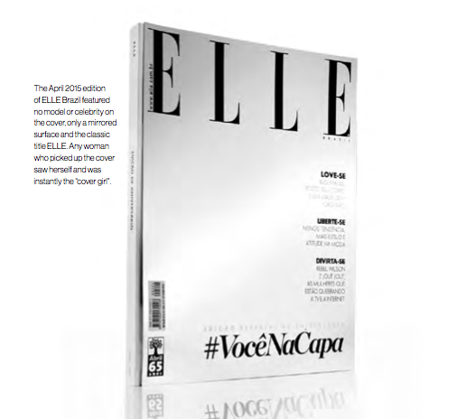
No models. No cinema stars. Just a mirrored surface and the classic Elle flag.
Any woman who picked up the cover saw herself under the big ELLE, and was instantly the “cover girl”.
To celebrate ELLE’s 27th anniversary, the editors used the cover to have fun and make a point: “More than a case, it is a cause that we are defending that every woman has her beauty and therefore deserves to be on the cover. The idea is to really honour who is at the center of fashion: Women,” editorial director Susana Barbosa said.
The social media campaign around the cover used the hashtag #VocêNaCapa to encourage readers to use the cover to snap a photo of themselves and post it on social networks with the hashtag. Subscribers to the digital edition on the iPad could trigger a photograph on the cover and then post the resulting image on social networks.
The April 2015 edition of ELLE Brazil featured no model or celebrity on the cover, only a mirrored surface and the classic title ELLE. Any woman who picked up the cover saw herself and was instantly the “cover girl.”
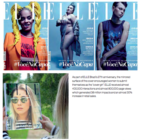
And to really expand awareness of the cover, ELLE placed a camera at a highly trafficked site downtown where passers-by could snap a “cover shot” and hundreds of people took
advantage.
Mimicking haute couture, the cover, too, was hand-crafted, assembled by hand one at a time, with the mirrored surfaced glued by hand to the front of each edition, making each a collector’s item.
Not content with just the cover innovation, ELLE’s editors also did an entire fashion shoot in the edition with a drone.
The editors also used augmented reality and the ELLE TV app to deliver backstage films of the São Paulo Fashion Week from the print magazine pages. To promote the special issue, ELLE sent copies of the edition to influencers. “Fashion sector professionals, celebrities and opinion leaders receives an exclusive mirror with the ELLE cover, inviting them to participate in the action,” said marketing director Lilian Dutra.
There was more fun to be had with Neutrogena’s advertisement for a makeup remover that enabled readers to actually rub makeup off a model’s face on the cover of the Brazilian weekly Caras in mid-2015.
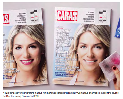
The magazine included a set of Deep Clean wipes which readers could use to clean the
makeup from actress Giovanna Ewbank’s face. Studies show that touching and handling a product reinforces connections and even entices consumers to pay more for a product, according to the agency handling the Caras campaign, DM9DDB.
“This interactive piece of press gives consumers the power to star in the campaign: They handle the product, test, prove and evaluate the outcome,” DM9 vice president of media Drian Ferguson told AdNews.
That’s agency-speak for “consumers have fun, they enjoy the product, and they probably tell their friends.”
(By the way, the “Touching is believing” study released by UK newspaper marketing company Newsworks, media agency PHD, and University College London in mid-2015 and “The effect of mere touch” study out of the University of Wisconsin and University of California in 2009 both found that confidence, satisfaction, reliability, trust and the willingness to purchase, all increased when consumers actually touch advertisements in print or digital formats. Touching print ads, for example, increased readers’ belief that the brand is honest and sincere by 41%, quality perceptions by 20%, and purchase intent by 24%.)
Sticking with the theme of fun and the idea that touching is believing, two other companies launched print campaigns with readers making festive calendars and masks.
UK network provider Three used print advertisements to give readers the opportunity to create a festive paper calendar featuring themselves, and the Great Ormond Street Hospital Charity used print advertisements to give readers the opportunity to create a face
frame for a #BadHairDay selfie and donate.
Some innovations take your breath away.
A progressive Vienna-based men’s magazine, Vangardist, wanted to rekindle awareness of the HIV crisis. Their approach was unique in the extreme: The cover and every page was printed with HIV+-infused blood donated by three HIV infected men.
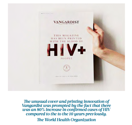
The blood was sent to the University of Innsbruck for pasteurisation, where the heating process ensured that the disease could not be transmitted. The unusual cover and printing innovation was prompted by the fact that there was an 80% increase in confirmed cases of HIV compared to the 10 years previously, according to the World Health Organisation.
“The reason why that’s happening is people just aren’t talking about it anymore,” said Jason Romeyko, the executive creative director of Saatchi & Saatchi Switzerland in a press release.
The HIV-ink editions came wrapped in plastic, just for effect, with the instruction: “Break the seal and help break the stigma”. Vangardist created 3,000 copies of the special edition in both German and English. Watch a powerful video about the innovation at vi- meo.com/133507827.
That example aside, fun has been far more prevalent than provocation.
We’ve seen three really wonderful print ideas: The world’s largest print magazine, a colouring magazine for “grown-ups”, and a magazine to be read using your foot.
Publishing the world’s largest-ever magazine is nothing new, but the sizes keep growing and that is fun in and of itself.
This time it was the folks at Healthy magazine creating a 7.179 square metres magazine — beating the previous Guinness World Record of 6.96m2 (Visionaire in 2011). The new champion magazine measured 3.055m in height and 2.35m in width.
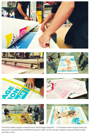
The record-breaking magazine took 14 hours to print and weighed in at 238 pounds or 107 kg.
“The idea for producing the world’s biggest person-size magazine came about because at River we like to innovate and everybody these days is saying it’s all about digital and social media and not about print. While we have a thriving digital, social media and, indeed, video business, for us print is still at the heart of a lot of what we do,” said Nicola Murphy, CEO of The River Group.
From the biggest to, perhaps, the calmest.
Eye to Eye Media, parent of 50 puzzle titles, launched a colouring magazine for adults in mid-2015.
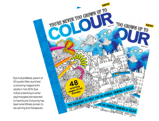
“Captivating, calming and creative, colouring-in for adults is an increasingly popular pastime for people looking to de-stress, unwind and relax in this ‘always-on’ world, allowing readers to take some time for them- selves, enjoy a little escapism, and make the most of some quality ‘me-time’,” Eye to Eye management announced.
Eye to Eye is banking on what psychologists are reported to have found: Colouring has been scientifically proven to be calming and therapeutic. The folks behind the launch believe that when humans concentrate on the detail of a picture while choosing the colours and rhythmically following the pattern of colouring-in, they can dramatically reduce their heart-rate and free their minds of everyday turmoil.
Then there was the exotic (and, you have to admit, bizarre) new magazine about feet designed to be read, appropriately, with your foot. Whether this was a good idea or not (and it would easy to argue the latter), it nonetheless demonstrates that there are still minds out there looking to break new print frontiers, as crazy as those may be.
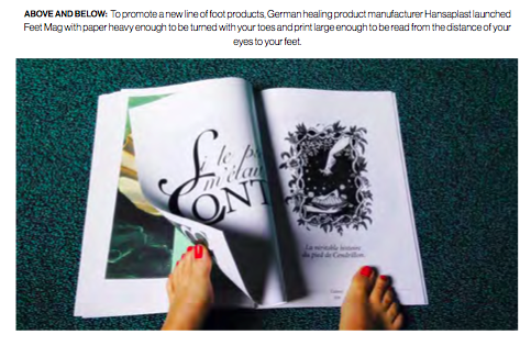
To promote a new line of foot products, German healing product manufacturer Hansaplast launched Feet Mag with paper heavy enough to be turned with your toes and print large enough to be read from the distance of your eyes to your feet.
As bizarre as the whole scheme sounds, the stories and design are quite good and worth a look (check out an edition of the magazine at bit.ly/1VSXvuJ). They have pulled together foot-related art by Renoir, Gauguin, Delacroix and Manet as well as incredible shoe photos, foot horoscopes, and fashion pics.
We have always believed the best approach to print innovation is to pair print with digital. In March, AnOther magazine out of the UK debuted the first-ever LED cover of a print magazine.
The cover is a very thin, custom-made LED screen featuring a moving image of Rihanna in a variety of sexy poses accompanied by a soundtrack by John Gosling. The rest of the magazine is in print. (Watch a video about the creation of the LED cover at bit.ly/1A06uyu).
The project almost didn’t happen as the challenge of creating an LED screen thin enough to be a magazine cover seemed unachievable. But then AnOther cofounder Jefferson Hack had lunch with custom design manufacturing company PCH founder Liam Casey. Casey happens to operate a digital hardware innovation centre called Highway 1 in San Francisco. Casey put Hack in touch with the Highway 1 staff and they began developing prototypes. Finally, they came up with an LED cover thin enough to work, just in time for the launch at fashion hotspot Colette in Paris followed by another launch at Selfridges.
“I’m really interested in how the industry responds to this gesture,” Hack told TheBusinessOfFashion.com. “Colette is the launch lab for the industry and we’ll be engaging with a wider audience with a Selfridges launch, where we are doing windows. It will be interesting to see how people react across territories, how people react culturally, how the technology side of the industry reacts and how the consumer reacts. The virtual circle of all that is, hopefully, going towards more innovation in this space.”
Finally, one design director who has wanted to bring interactivity to print pages for years finally got his chance.
The Los Angeles Times publishes an Oscar Awards preview edition every year. This year, for the 2016 Oscars in February, assistant design director Michael Whitley came up with the idea of making the cover of the supplement interactive.
Describing himself to the Poynter Institute as “borderline obsessed with trying to create motion and interactivity in printed pages,” he said he wanted to capture the way you can change what you see on a phone with a swipe or click.
“This year we just decided it was no time to play it safe, and we would never figure it out unless we committed to it,” Whitely told Poynter.
His idea: Publish a cover with three rows of Oscar statues. On page two, print the same three rows of statues but dressed in the bright, colourful clothing of some of the Oscar nominees. Line the statutes up precisely on both pages. When readers held the cover up to a light source, what had been simple Oscar statues were transformed into gorgeously dressed statues.
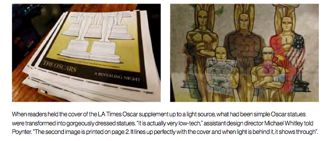
“It is actually very low-tech,” Whitley told Poynter. “The second image is printed on page 2. It lines up perfectly with the cover and when light is behind it, it shows through. It also keeps page 2 intact. We designed it to stand on its own, knowing not everyone will hold the page up to a light. That might be my favourite thing about it — it works if you hold it up to the light, but if you don’t, page 2 still reads like a regular page.”
There were doubters, including Whitley himself. ”I wasn’t even sure,” he said. “The ultimate question we faced was is the paper thick enough to hold the ink and thin enough to show the image really clearly. The only way to find out for sure was to try it for real.
“It was a huge relief to see it come off the press,” he said. “Our pressmen really rise to the challenges we create, and we all ate some doughnuts and shook hands at 3:00 in the morning at the printing facility over how cool the final result was.”
Wasn’t that fun?!
Come back next year for a whole new set of inspiring, provocative, mind-bending ways of telling stories and selling products and services.
This article is one of many chapters published in our book, Innovations in Magazine Media 2016 World Report.


