27 Feb Design keys for news websites
Over the last 15 years I have seen the same mistakes over and over in news websites. You can design your website according to your corporate brand and needs, but please don’t forget about these concepts.
Immediacy and depth need to coexist. An in-depth article that your newsroom has been working on for the last two weeks probably deserves to be in your front page for more than one or two days (if you check your Google Analytics you will be amazed to discover that that your average user only comes to your site every two or three days). And at the same time you can never take your eye off the latest breaking news.
How do we make sure that immediacy doesn’t sink depth? Well, you can design it the way you like, but think of them as two watertight silos, both need to be there if you want to be seen as a news organization that is both accurate and fast.
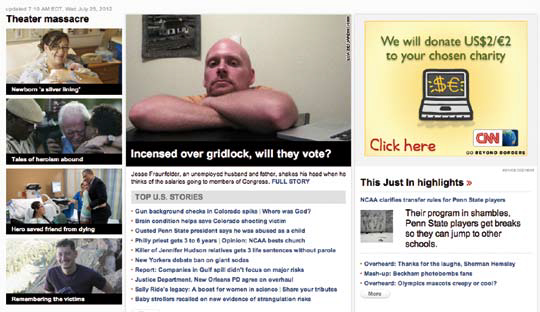
This is just an example of how breaking and in depth news can coexist in the same page.
Break your news as they happen
So many times I’ve seen editors waiting to have more than just a headline to put something in the front page. This is a big mistake.
You don’t need to have the 5W’s to break the news (of course, if you do have them, so much the better!), at some point all we know about a particular incident is “Plane presumed lost over the ocean”, from here until every single detail of the story is known there can be 25 developments of it, and we need to be able to fit them all in our front page. Remember, it is both the journey and the destination.

This two images belong to the same website, just with different configurations

Have several front-page templates
Your front-page editor has to be ready to choose the design template that best suits the number of news that you want to feature above the fold in your main page. This can be achieved by having several front page templates with a number of different designs, or by having a CMS that allows for wysiwyg modules that an editor can drag and drop on the fly to decide the number of columns he or she needs for a particular headline or image. Any decent commercial CMS should allow you to either have several templates or play with modules.
Get rid of Flash ASAP
I hope that you are not using Flash in your site anymore; it used to be a great addition for some websites but now it can actually be prejudicial to your operation. Why is that? The two main reasons that I can give you are;
1. Google does not read what’s inside a Flash file, therefore it cannot index it and you can forget about having SEO benefits.
2. No device running IOS can read and display a Flash file. In other words, no Ipad or Iphone can read a Flash file. Are you willing to live without those consumers?
Mobile MobIle Mobile
Make sure that your pages are displayed correctly in any smartphone with web capabilities. Everyone has a device in their pocket capable of browsing your site; broadband, 3G and Wi-Fi networks are a reality. Sooner than you think your website will be accessed more from mobile devices than from online desktop computers and laptops. Some of the more prominent entertainment and news websites in the U.S already are.
This is how the Fox News website looks in my Iphone. Come on Fox News, you can do better than this!

by Álvaro Moncada
Consultant, INNOVATION International Media Consulting Group


