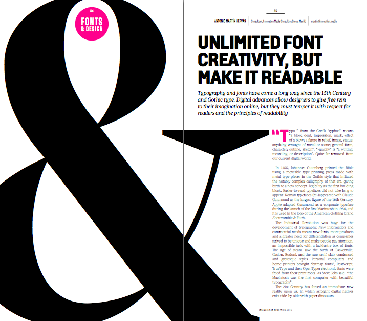
07 Nov Unlimited font creativity, but make it readable
Typography and fonts have come a long way since the 15th Century and Gothic type. Digital advances allow designers to give free rein to their imagination online, but they must temper it with respect for readers and the principles of readability.
“Typo-”—from the Greek “typhos”—means “a blow, dent, impression, mark, effect of a blow; a figure in relief, image, statue; anything wrought of metal or stone; general form, character; outline, sketch”. “-graphy” is “a writing, recording, or description”. Quite far removed from our current digital world.
In 1455, Johannes Gutenberg printed the Bible using a moveable type printing press made with metal type pieces in the Gothic style that imitated the notably complex calligraphy of that era, giving birth to a new concept: legibility as the first building block. Easier-to-read typefaces did not take long to appear: Roman typefaces (re-)appeared with Claude Garamond as the largest figure of the 16th Century. Apple adapted Garamond as a corporate typeface during the launch of the first Macintosh in 1984, and it is used in the logo of the American clothing brand Abercrombie & Fitch.
The Industrial Revolution was huge for the development of typography. New information and commercial needs meant new fonts, more products and a greater need for differentiation as companies strived to be unique and make people pay attention, an impossible task with a lacklustre box of fonts. The age of steam saw the birth of Baskerville, Caslon, Bodoni, and the sans serif, slab, condensed and grotesque styles. Personal computers and home printers brought “bitmap fonts”, PostScript, TrueType and then OpenType: electronic fonts were freed from their print roots. As Steve Jobs said: “the Macintosh was the first computer with beautiful typography”.
The 21st Century has forced an immediate new reality upon us, in which arrogant digital natives exist side-by-side with paper dinosaurs.
Unlimited New Possibilities
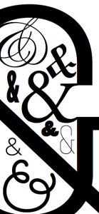
Just 15 years ago, the very limited use of system fonts was a web designer’s nightmare. Today we can choose the font that best suits our needs. We are not condemned to eternally using Arial; there is now a very long list of options available, many of them free. High-resolution screens means font selection parameters and legibility are almost the same as on paper. Serif fonts, previously anathema for online readability, are making a comeback.
Then there are mobiles or, more precisely, smartphones and tablets. 1.75 billion are sold every year. 5 billion people are expected to own “pocket supercomputers” by 2020, according to Andreessen Horowitz. That is a lot of information consumers, certainly enough to think a bit about using typography properly.
Today’s challenge is not that of Matthew Carter, who had to design a typography for the phone book. Bell Centennial had to aim for the smallest possible legible font size to reduce the number of pages and the cost of production.
Nowadays, there are no limits to typographic creativity and even the rules of the game have changed but, at the end of the day, the goal is the same: be readable. In 2016, our challenge is to promote attention and reading in small spaces, as always, but keeping an eye on time (attention) and movement, instead of the amount of ink we need. For Gerard Unger, a Dutch typographer born in 1943, “it is almost impossible to look and read at the same time: they are different actions”.
Now, more than ever, we have to make an effort so that our users pay attention to the content. Content plus context is one of the most important principles when thinking about digital design.
A Moving Target
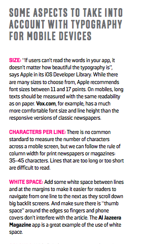
The space we fill is no longer always fixed. The same content must be readable on a desktop, a tablet and a mobile phone. It is not just about the best typography but how we write headlines and the amount of text we use. A two-line headline on our desktop might be too long to fit on a single mobile screen and force the reader to scroll for his information. Responsive is a double-edged sword.
The way we lay out readable, scannable text on our digital products will affect whether or not a user comes back: a balance must be struck between typography and content. The definition of readable has also changed, and must not be removed from the concept of usability. 15th Century readers had no problem reading Gothic fonts; we do. 18th Century newspapers are tortuous to read. The tiniest typographic details must be evaluated.
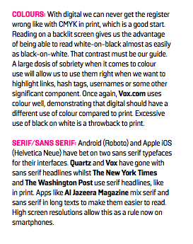
One good piece of news is that the colour white is back. Both big desktop and mobile screens have allowed us to simplify the presentation of information in creative ways. Aesthetics, readability and typography are once more part of the essential design elements of our newspapers, on every platform.
Readability for readers
Whether in apps or with responsive design, our aim should be to select a font that adapts to its context, making it easier on the reader or user, more accessible and more efficient, without having to design a series of different solutions. Simplicity, immediacy and order, surrounded by enough white space. And be bold with headlines, it is often the only content many readers see, so immediate contrast and depth are necessary.
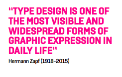
“Type design is one of the most visible and widespread forms of graphic expression in daily life. It is still not noticed by all readers of newspapers, magazines or books. Nevertheless letter forms reflect the style of a period, and its cultural background. We are surrounded by them everywhere”.
That phrase by the famous German typographer Hermann Zapf (1918-2015) helps us to understand that typography, the physical expression of language, is the way we transmit our message to the recipient of our content. Fonts are not just about decoration of aesthetics. Our messages are increasingly being read mainly on mobile phones, although desktops and tablets are still important. Get the typography right, but make sure you get readability absolutely right on new devices, for new readers.
INNOVATION’S TAKE:
We should fully appreciate the possibilities new technologies offer us to provide our readers and subscribers with a superlative design and reading experience, that properly highlights the right parts of our articles and content but — in an ever more atomised digital, mobile and social world, which is still speeding up — we must pay special attention to the principles of readability out of respect for those same users, and prioritise those principles above creativity to encourage them to return.
This article is one of many chapters published in our book, Innovations in News Media 2016 World Report.


