26 Nov INNOVATION’s Decalogue for good user experience and human-centred design

1 Reduce cognitive load
Understand how human factors influence the experience and work towards a solution with the least cognitive effort for the user.
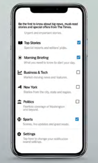
Example: The Guardian Mobile Innovation Lab’s notifications experiment during the UK’s snap election in June 2017 learnt from previous experiments to include easy sign-up options for different subjects, timestamps for results tallies, and investigated their users’ appetite for data-rich information in an alert.
2 Be aware of confirmation bias
Data analysis and human centred design methodology see the grounds for evidence-based design as a structured and rational process.
Quantitative data analysis tells us about behaviour. Qualitative analysis tells us about reasons for those behaviours. Be open to being wrong about gut feelings.
Example: For the Guardian’s notifications experiments mentioned above, the paper surveyed users after each experiment and carefully analysed the results to understand user behaviour and make changes accordingly. For example, the paper learnt that users close notifications not necessarily because they are not interested in them, but because they have obtained the information that they need.
3 Value is in the eye of the beholder
Delivering value is not just about the user but also to your organisation; think about user challenges as well as business goals. Design should be holistic, investigating the entire experience of the user including the context of use and user environment.
Example: For the 2018 Winter Olympics, The New York Times started to send notifications to users through its native mobile app rather than through SMS. As graphics editor Troy Griggs told Nieman Lab, this means that the analysis tells us about paper controls the whole space, while saving money on SMS costs, and it allows the Times to integrate the content and experience in new ways.
4 Invest in knowing your users
User-Centred Design – and its mindset of bringing users into the design process – exists to reduce gaps between creators and product users. UX is about putting the user in focus, not just pretty pages and pixels.
Example: when The New York Times was preparing to launch its Spanish language edition targeting a Mexican audience, the team spent time in Mexico City to learn directly from their potential readers, to gain insight that would support their product and editorial strategies, wrote Juliette Melton, design researcher at the Times, on Medium. The team worked with the audience to discover their needs, rather than making assumptions.
5 UX is the strategy
Describe your vision – clarity on this will help you define which hypotheses you want to test and the data you will collect.
Example: Scandinavian publisher Schibsted restructured its product team in 2016, centralizing its efforts into one unified product and technology group that works across all publications and has a clear vision and goals. “We want to build common product and common technology, not just for the newsroom, but for the end user and migrating toward that,” the company’s VP of product management, Espen Sundve, told Nieman Lab.
6 Take in the big picture
UX design looks at the brand’s ecosystem holistically, to ensure customers can transition from one channel to another without friction. Whether accessing your website, downloading an app, watching a video or reading a story, all these moments build up to a brand experience. Study services and legacy products to understand the audience’s experience, leverage the learnings and apply them to new projects.
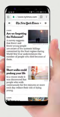
Example: When the Guardian relaunched in a new tabloid format in early 2018, it also redesigned its website and apps in line with the print edition. According to the paper’s executive creative director Alex Breuer, the new design has “a more flexible page layout in print and online and enhanced use of photographic journalism and graphics.”
7 Change is inevitable
Iteration can feel uncomfortable, but that discomfort leads to certainties.
As customer journeys become more fragmented, it is our job to ensure brands are telling a coherent story across channels. The experience of users does not stop at every screen.
Example: News outlets have started to target customers on voice control systems such as Amazon Echo and Google Home. The BBC has produced a news briefing skill for the Alexa operating system and now hopes to pair editorial staffers with software engineers to investigate what kind of content experience people want, to inform new interactive editorial formats, Digiday reported.
8 Test, test and test again
User testing, quality assurance and reviews should be conducted every step of the product lifecycle.
Example: As part of its preparation for its Spanish language edition, the New York Times team combined ethnographic research methods with data science: they first conducted field research that included a series of one-on-one interviews in participants’ homes, offices, or on their commutes, focus group sessions, and followed this with “ongoing, iterative, quantitative research,” wrote Juliette Melton, design researcher at the Times, on Medium.
9 It’s all in the experience
UX is not just how the interaction works; UX is about how your user experiences the product. UX is about individual experiences: we do not design one experience, we set the groundwork for each user to have the best experience with a product or a service.
Example: The New York Times’ texting experiment for the Olympics aimed to communicate directly with users using a conversational interface that allowed for personalization options such as what events an individual user is most interested in. The system remembers readers’ choices so that it can send relevant messages, and then analyses their responses in order to respond further. It’s a very different experience to having push alerts sent in an omniscient voice, Ben Koski, director of interactive news att the Times, told Nieman Lab.
10 Business as usual
What is the bottleneck in your UX Strategy? Identify who and what can be influenced to change from “business as usual” to more focus on the user
Example: the Guardian is creating a product and user experience (UX) toolkit to help its product managers and UX designers build skill and confidence in their roles. Crucially, its focus is on why things work as much as how they work.